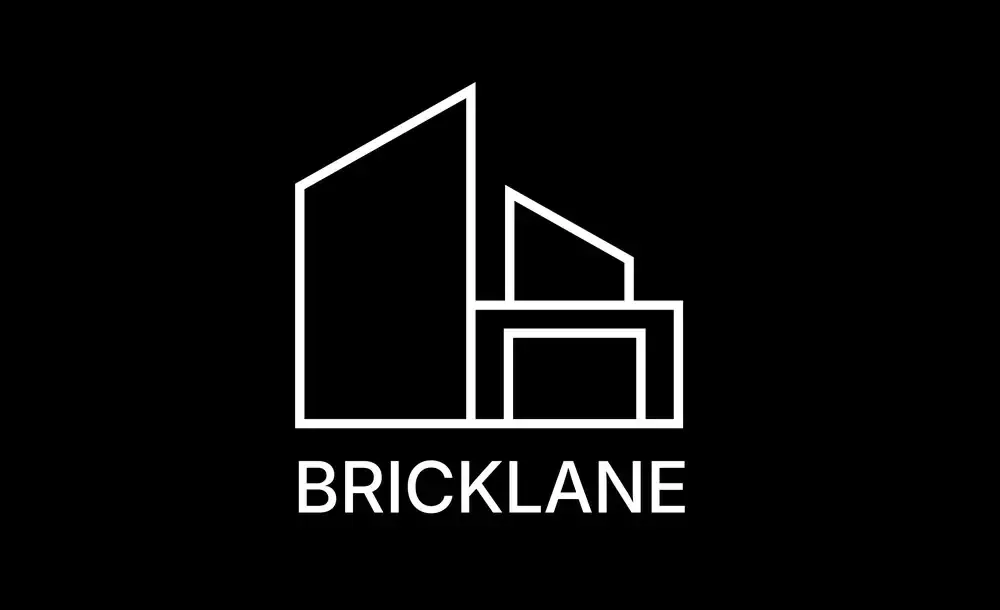
Bricklane
Building tomorrow’s living.
The brief
Bricklane is a modern real estate brand built around architecture, structure and forward-thinking development. The identity needed to communicate trust and professionalism while feeling contemporary, minimal and distinctive within the real estate space.
The creative direction
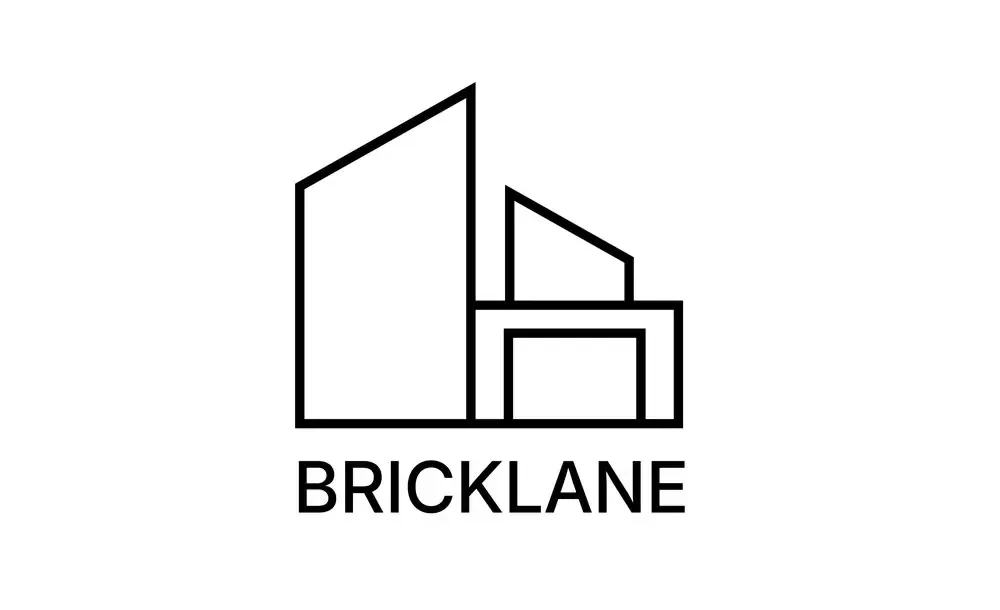
The logo was developed from a simplified architectural structure, combining different building forms into one clean geometric mark. The varied heights represent buildings and urban development, while the connected lines create a sense of structure, stability and growth. The visual system uses a black, white and neutral palette, giving the brand a confident, architectural and premium character.
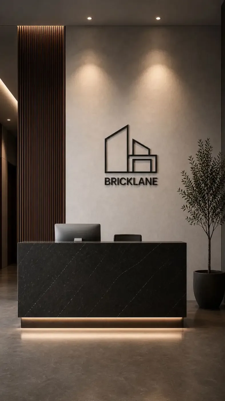
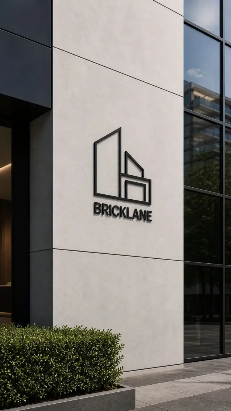
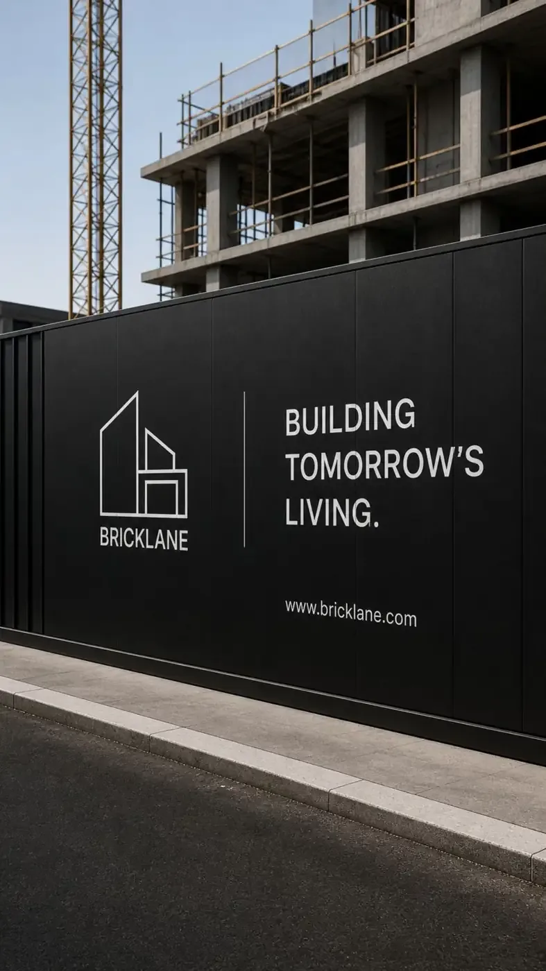
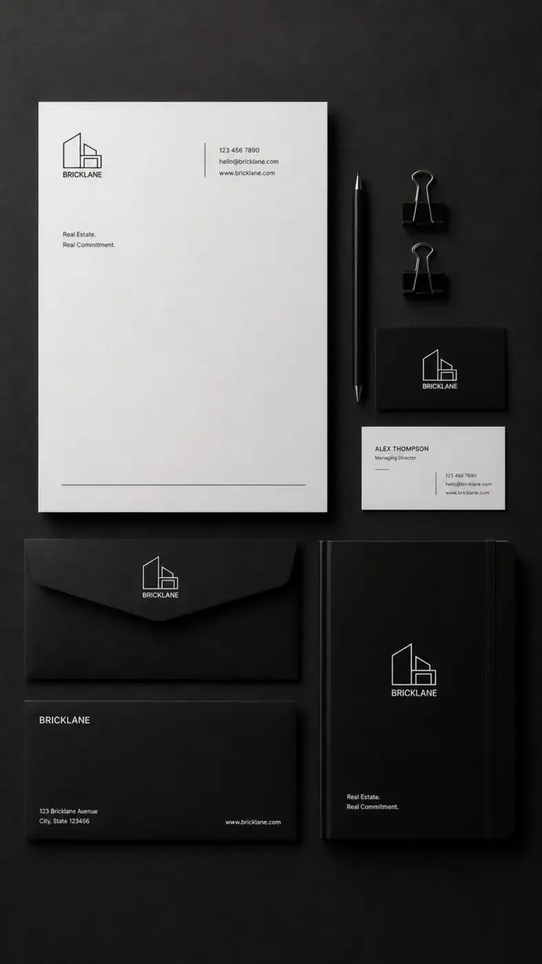
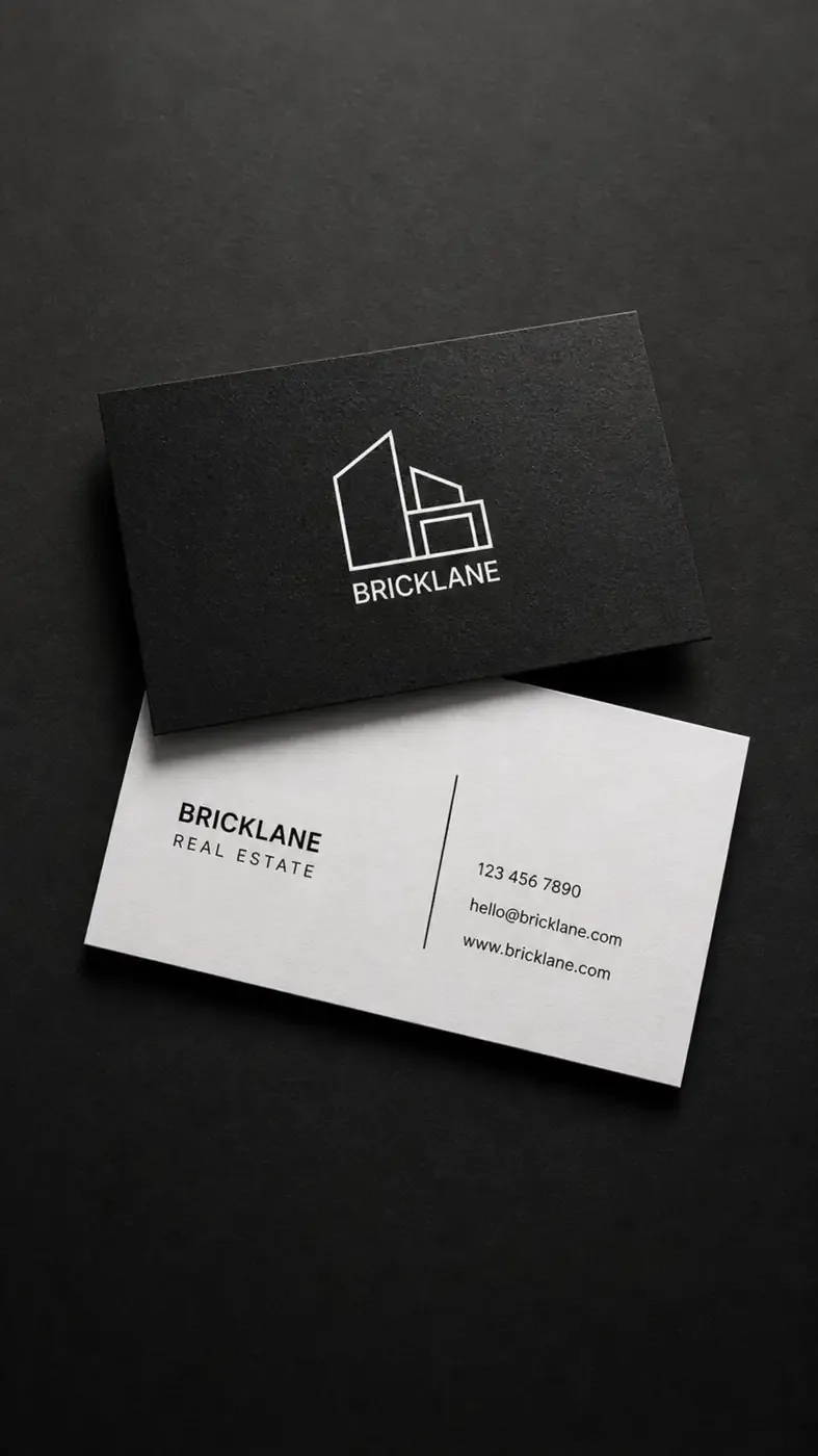
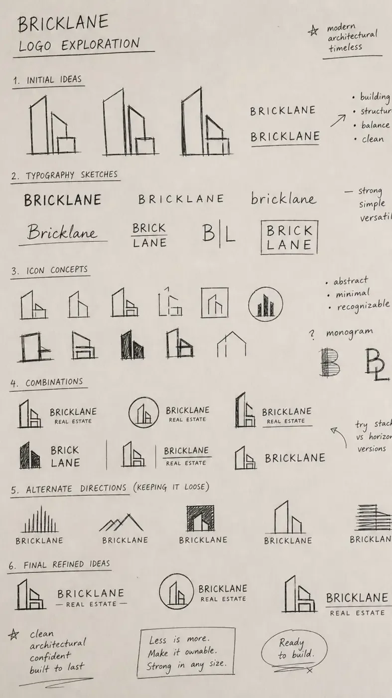
Logo variations
Colour palette
#0A0A0A#FFFFFF#C9C5BF#3A3A3ADeliverables
- Brand Identity
- Logo Design & Exploration
- Architectural Icon / Symbol
- Typography System
- Black & White Logo Variations
- Business Cards
- Letterhead
- Envelopes
- Corporate Stationery
- Brand Collateral
- Signage & Office Branding
- Construction Site Branding
- Real Estate Marketing Applications
The visual story
The identity is intentionally minimal and architectural. Strong geometric lines make the logo recognisable even at a small scale, while the monochrome palette allows it to work seamlessly across everything from business stationery to large-scale construction hoardings. The result is a visual identity that feels built, structured and timeless — reflecting the very nature of the brand.
Brand aesthetic
- Architectural
- Minimal
- Confident
- Modern
- Structured
- Timeless
Bricklane — Building tomorrow’s living.