Common Ground
Different paths. Same ground.
The brief
Common Ground is a contemporary sneaker brand built around the idea of bringing people together through movement, shared values and a more conscious approach to footwear. The identity needed to feel youthful, inclusive and progressive while maintaining the visual confidence of a modern sneaker label.
The creative direction
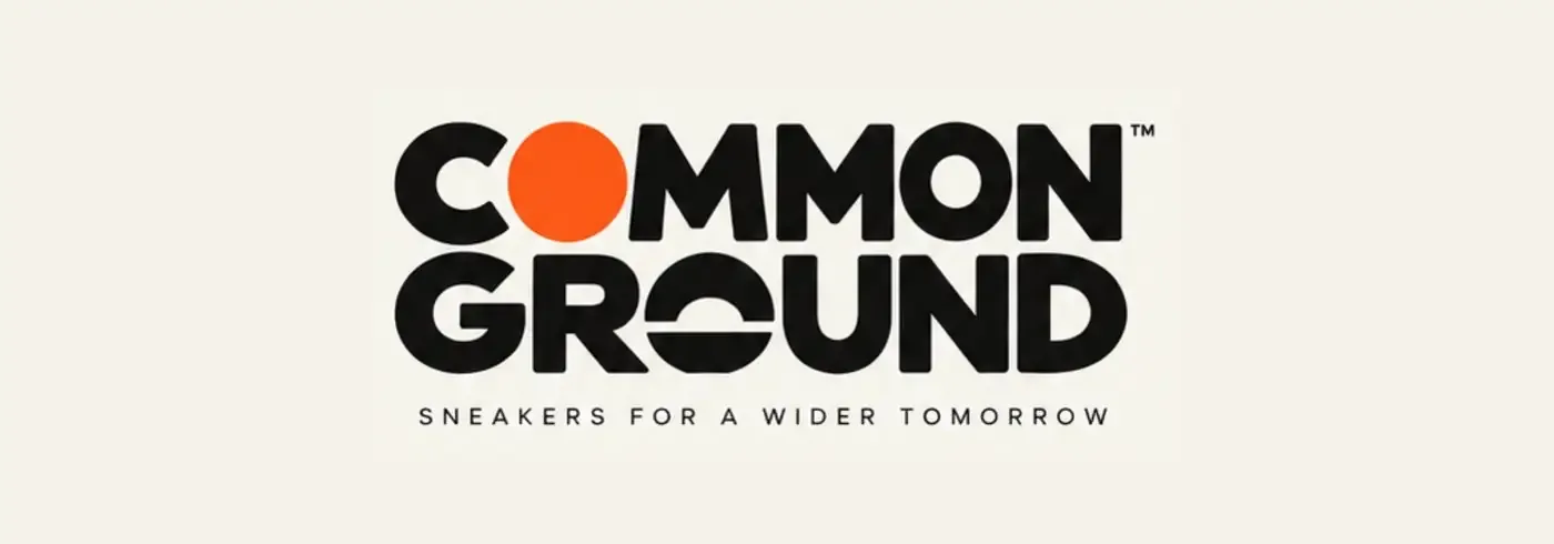
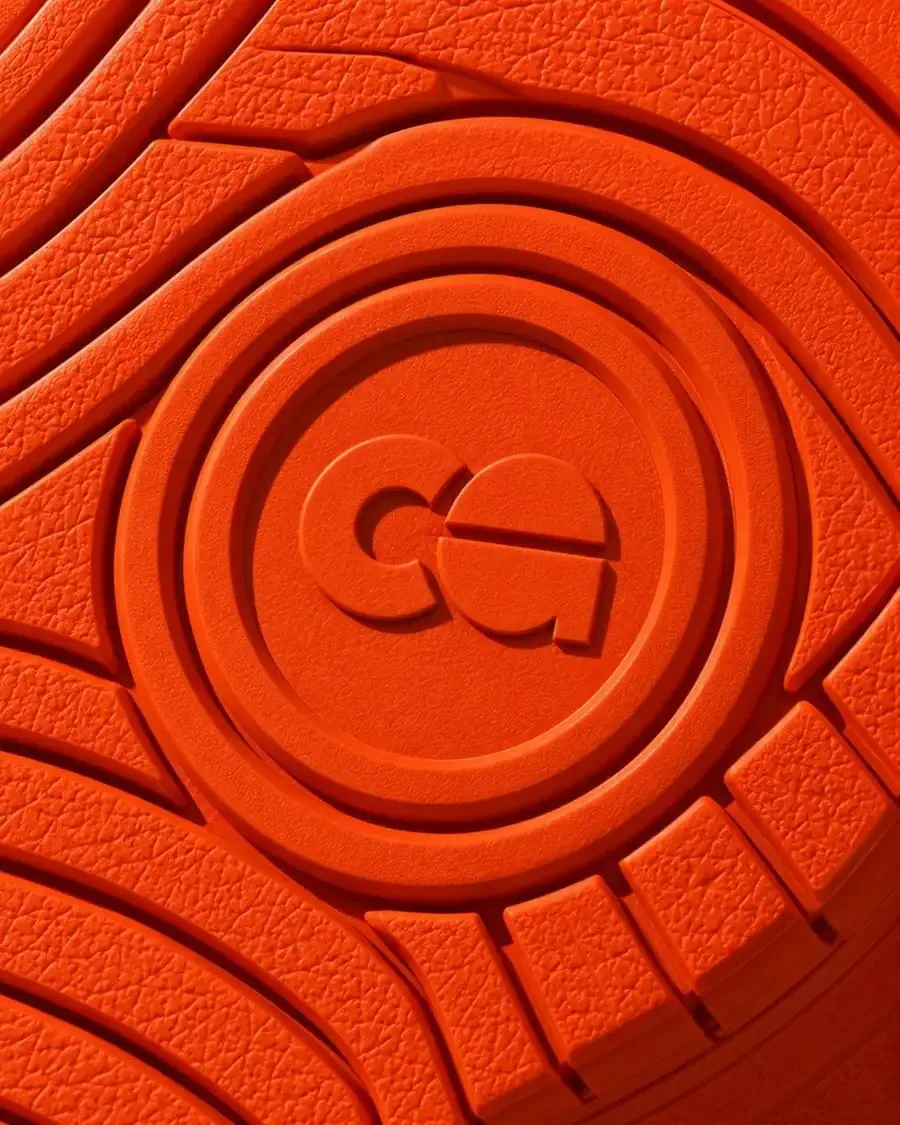
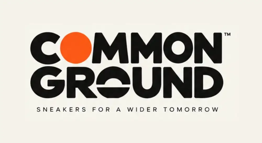
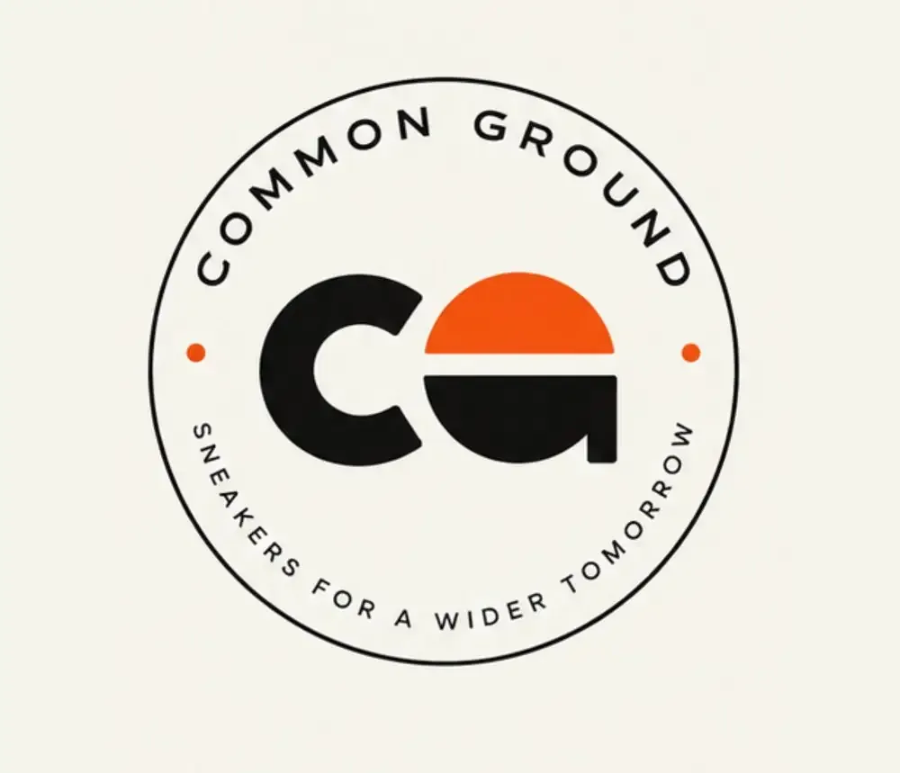
The identity is centred around a distinctive “CG” monogram, where the two letterforms visually connect to create a sense of unity. The orange semicircle introduces a bold visual element that can be recognised independently across products and brand touchpoints. The primary wordmark uses a heavy, geometric typographic style, giving the brand a strong streetwear presence while keeping the overall identity clean and approachable.
Logo variations
Colour & visual language
The core palette combines black for strength, versatility and urban culture; warm white / cream for sustainability, simplicity and premium appeal; and vibrant orange for energy, optimism and individuality. The restrained palette allows the orange to function as a recognisable brand signature across sneakers, packaging and communication.
#111111#F4F2EB#FB5917#B9B3AATypography
The typography is bold, geometric and highly legible, reflecting the brand’s contemporary sneaker positioning. The contrast between the heavy COMMON GROUND wordmark and the lighter supporting typography creates a clear hierarchy while maintaining a strong visual personality.
Packaging direction
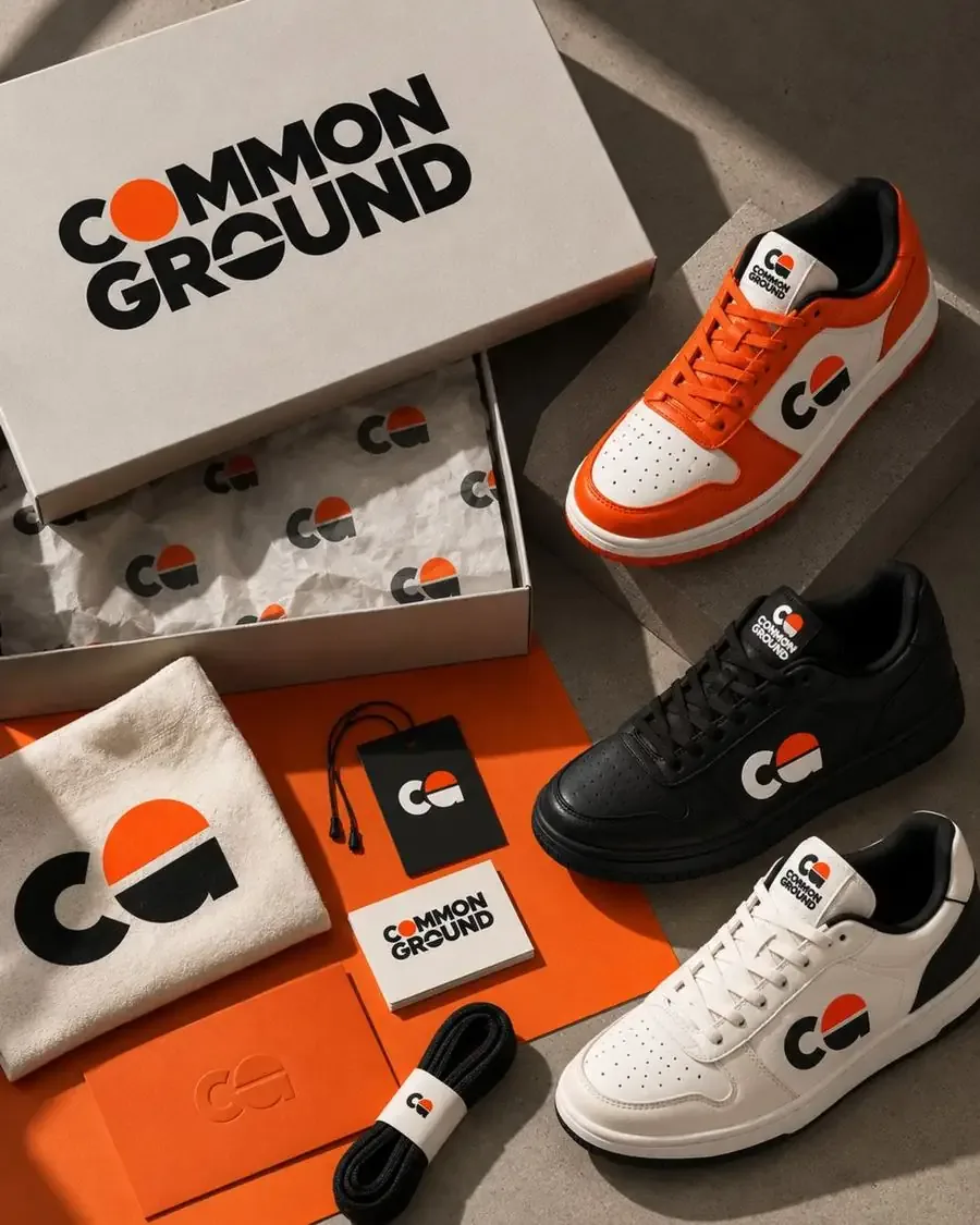
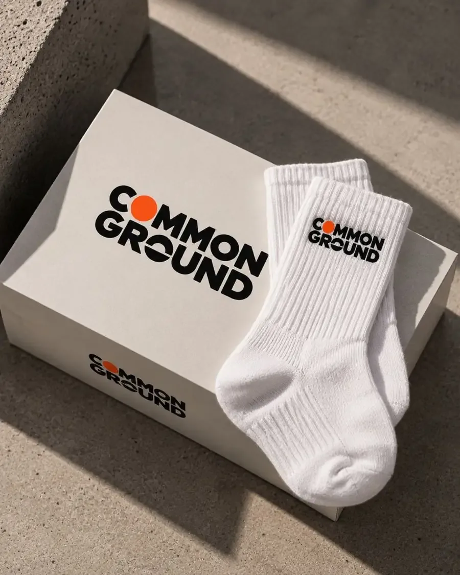
Packaging follows a minimal, tactile and premium approach, using warm neutral surfaces with strategic orange accents. The repeated CG monogram creates a subtle branded pattern across tissue paper and collateral, while the orange packaging elements create visual consistency throughout the unboxing experience.
Photography direction
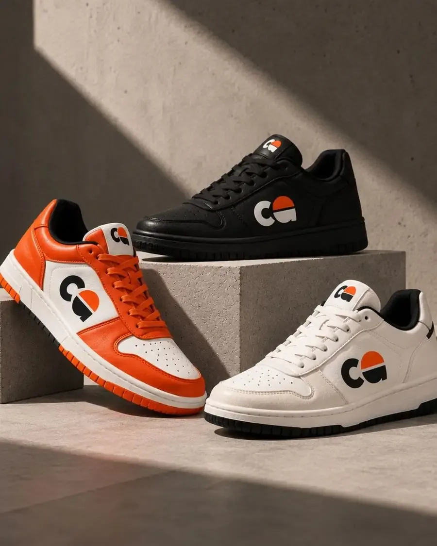
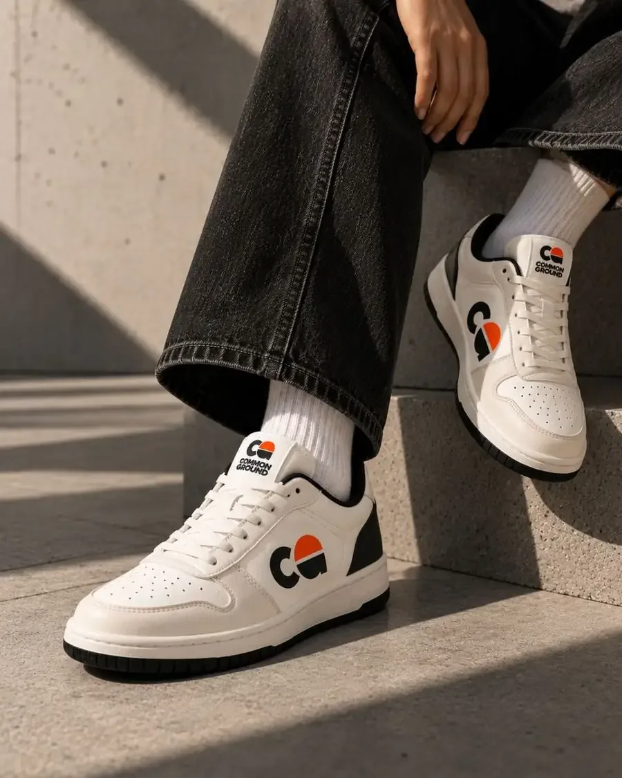
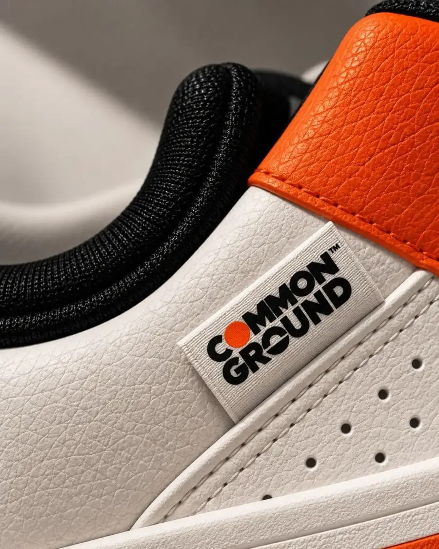
The photography combines architectural forms, natural light, strong shadows and close-up product details. Concrete surfaces provide an urban foundation, while the warm lighting and orange accents bring energy into the imagery. Product shots focus heavily on texture — leather grain, stitching, soles and embossed branding — to communicate craftsmanship.
Brand applications
- Primary Logo
- Secondary Logo
- CG Monogram
- Circular Badge
- Sneaker Branding
- Shoe Tags
- Shoe Boxes
- Tissue Paper
- Hang Tags
- Business Cards
- Socks
- Apparel
- Merchandise
- Product Photography
- Social Media Visual Direction
Brand story
Common Ground is expressed visually through the idea of different paths meeting on the same ground. The CG symbol, paired with the tagline “Sneakers for a wider tomorrow”, positions the brand around movement, community and a forward-looking mindset.
Brand aesthetic
- Bold
- Inclusive
- Contemporary
- Sustainable
- Urban
- Optimistic
Common Ground — Different paths. Same ground.