Common Table
Good food. Good people. Same table.
The brief
Create a warm, social identity built around good food, good people and shared moments.
The creative direction
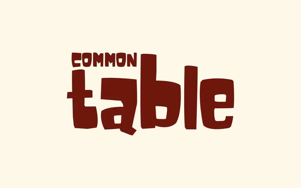
Bold, playful typography paired with a rustic, Italian-inspired visual language.
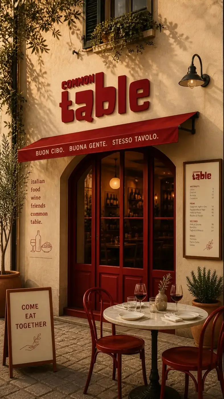
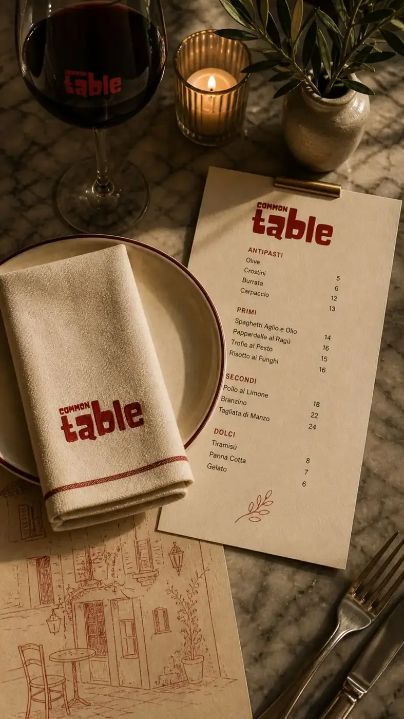
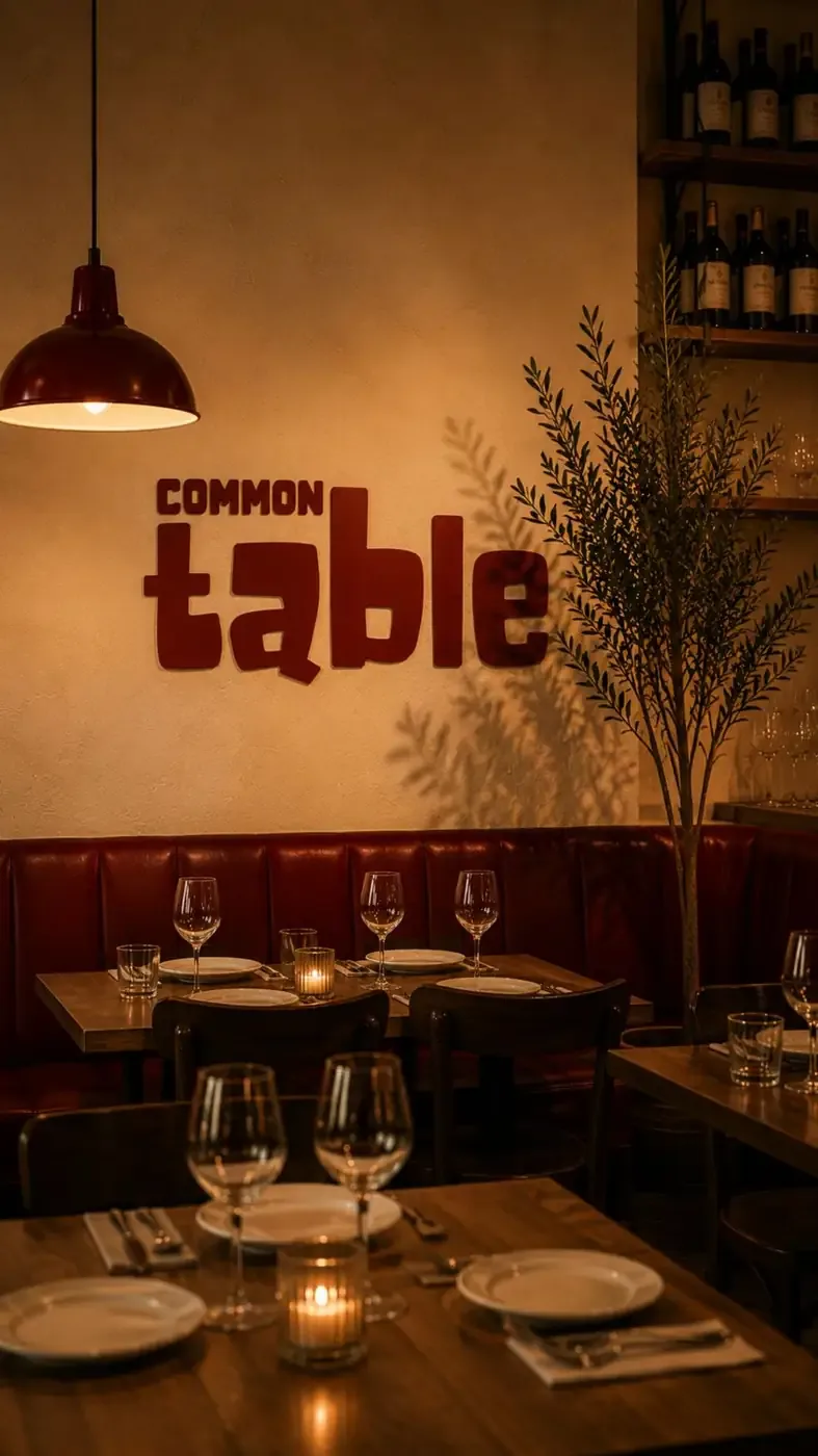
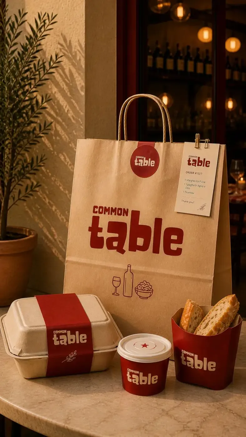
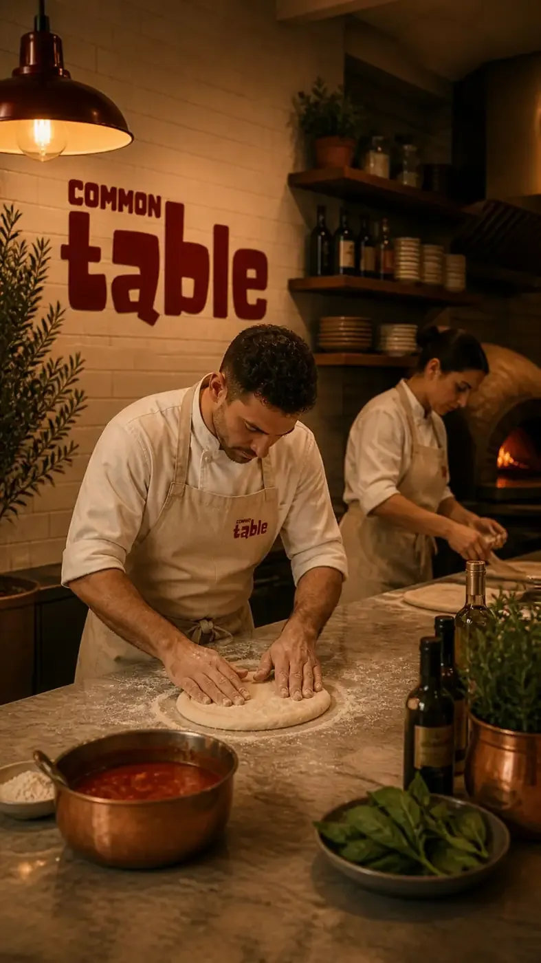
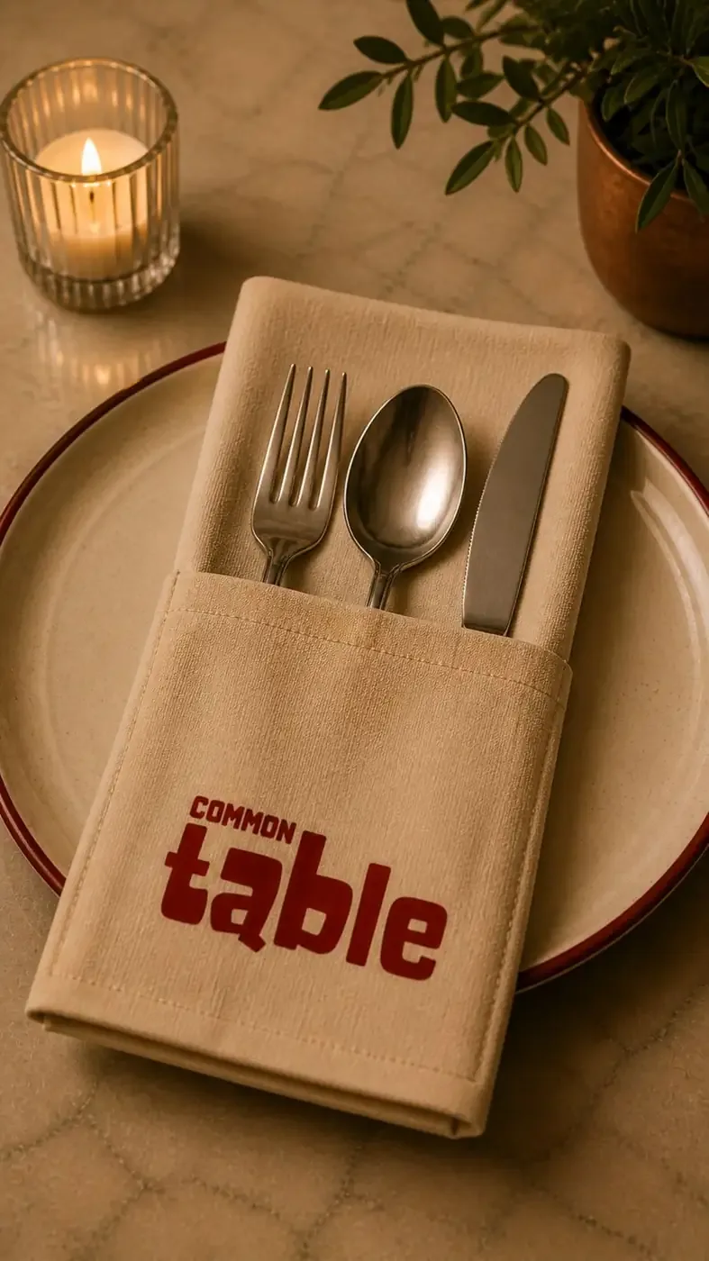
Logo variations
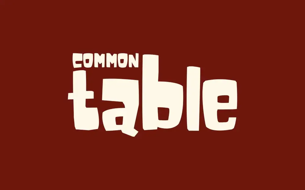
Colour palette
Deep burgundy, warm cream, terracotta and earthy neutrals.
Deep Burgundy
#70170DWarm Cream
#FFF8E9Terracotta
#B85C3CEarthy Neutral
#CDBBA0Visual language
Hand-drawn details, vintage-inspired illustrations, warm textures and bold typography.
Brand experience
Warm, intimate and welcoming — designed to feel like a place where everyone comes together.
Brand applications
- Menus
- Napkins
- Tableware
- Signage
- Packaging
- Uniforms
- Restaurant Interiors
Brand aesthetic
- Warm
- Rustic
- Social
- Playful
- Italian-inspired
Common Table — Good food. Good people. Same table.