Kahvaan
Heritage in every leaf.
The brief
Kahvaan is an Indian tea brand inspired by the rich culture, heritage and ritual of Indian tea. The brand needed to feel rooted and premium, bringing together traditional Indian aesthetics with a contemporary packaging system.
The creative direction
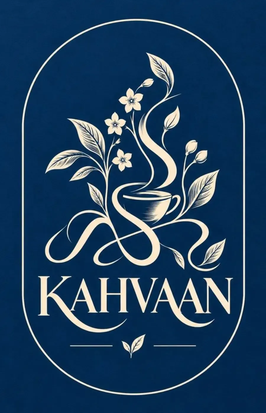
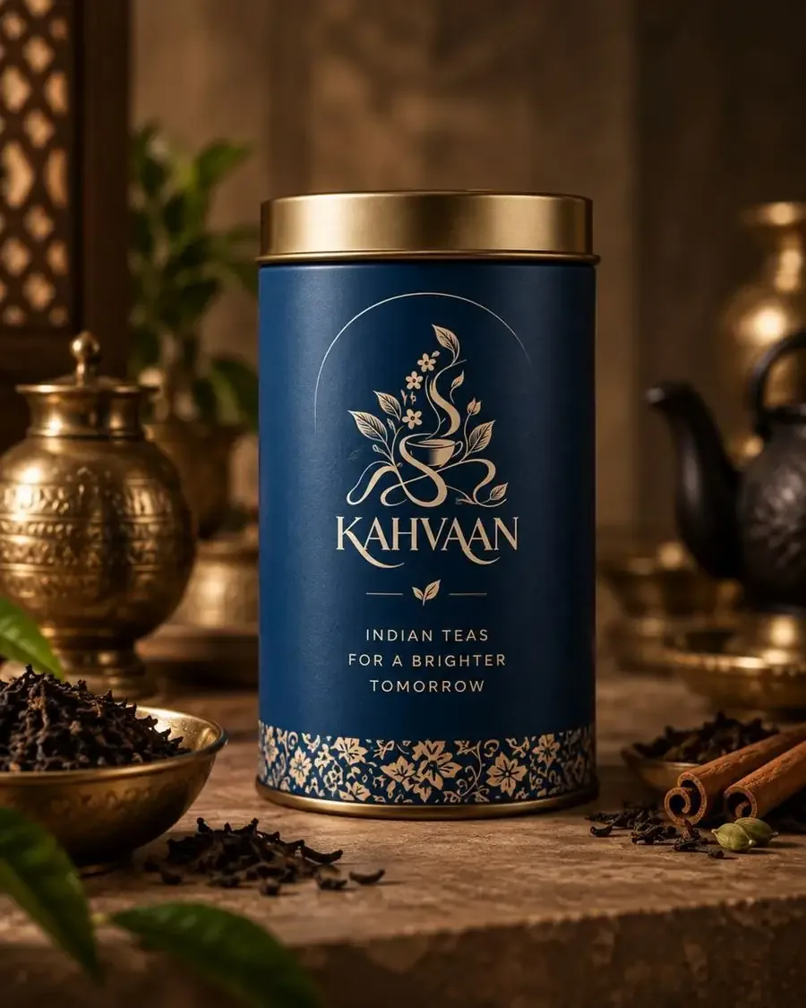
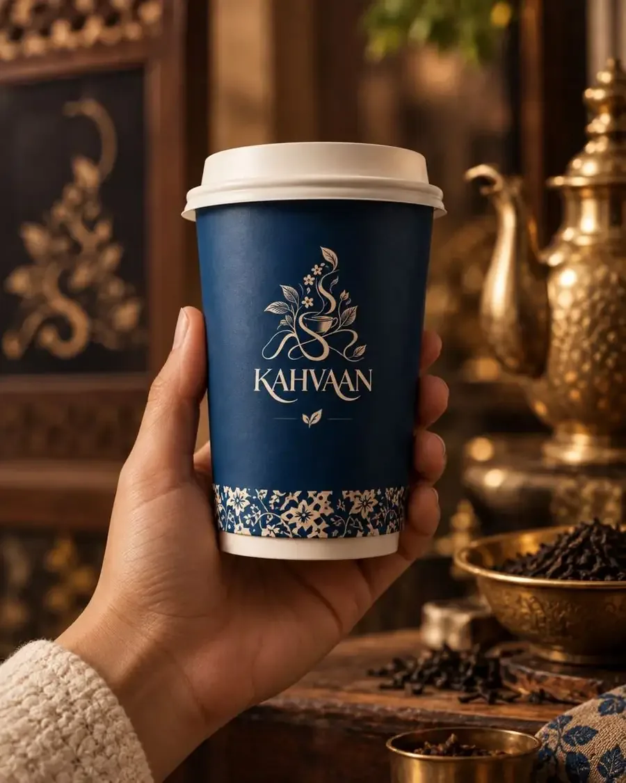
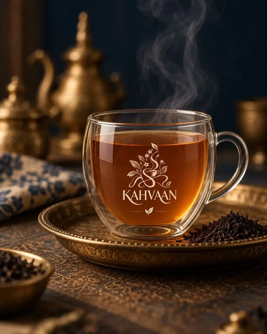
The identity combines deep blue, warm ivory and antique gold to create an elegant, heritage-inspired visual language. A detailed botanical illustration featuring tea leaves, flowers, flowing steam and a teacup forms the heart of the identity, representing the connection between nature and the ritual of tea.
Colour palette
#0B3A63#F1E6D0#C9A36ERange colours
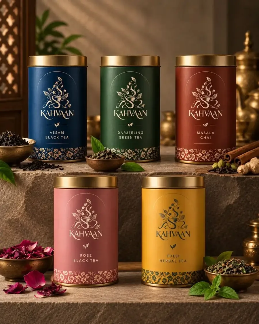
#1F3F6E#2F5B3E#8E3B2A#C9707A#E0A93ADeliverables
- Brand Identity
- Logo & Brand Mark
- Colour Palette
- Typography
- Tea Tin Packaging
- Product Range System
- Cups & Servingware
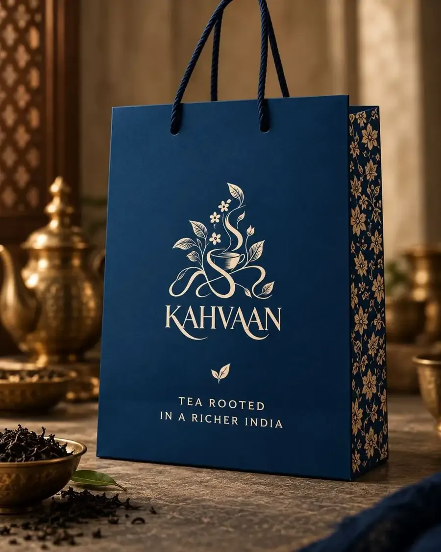
- Gift Bags
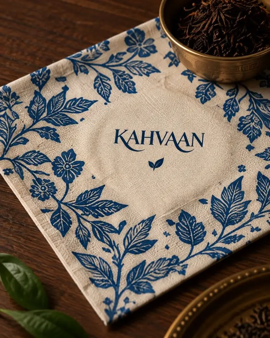
- Textile & Pattern Design
- Brand Collateral
- Packaging Photography Direction
The visual story
The visual identity draws from Indian botanical motifs, traditional craftsmanship and the warmth of tea rituals. The floral pattern becomes a recurring brand element, while colour variations distinguish different tea blends across the product range. The result is a packaging system that feels premium, culturally rooted and gift-worthy, while maintaining a consistent and recognisable brand presence.
Kahvaan — Tea rooted in a richer India.