The Learning Co.
Learn. Grow. Succeed.
The brief
Create a modern, approachable identity that makes learning feel fresh and inspiring.
The creative direction
A clean, geometric identity built around ideas of learning, connection and growth.
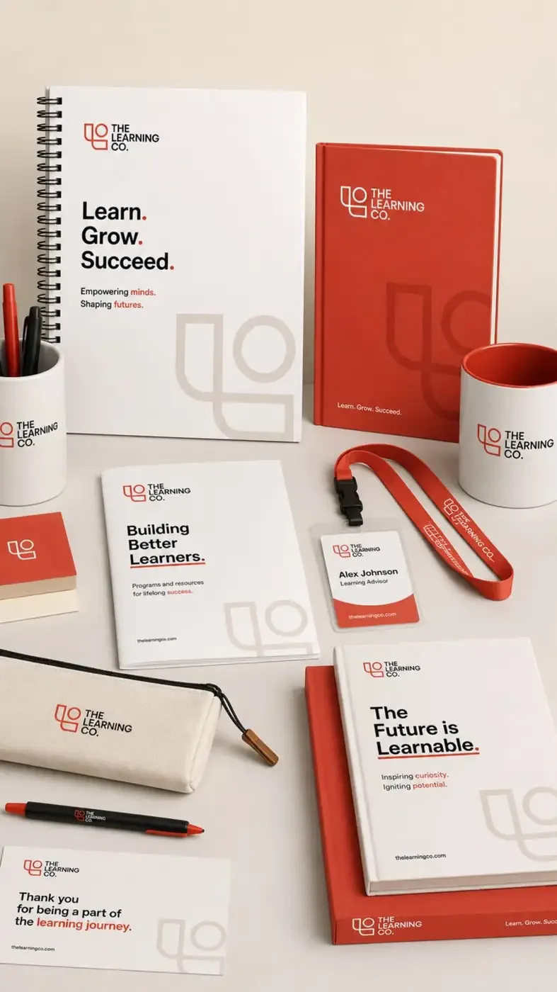
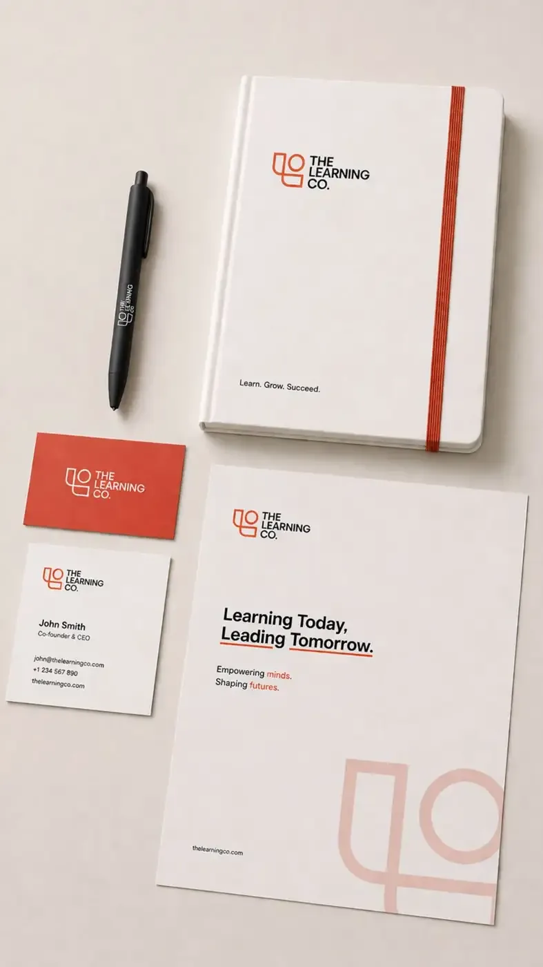
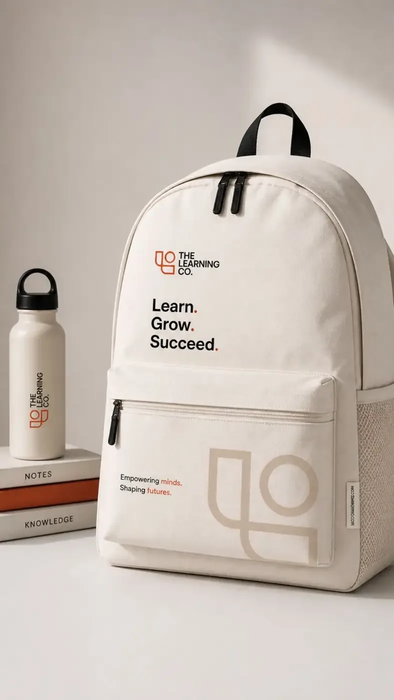
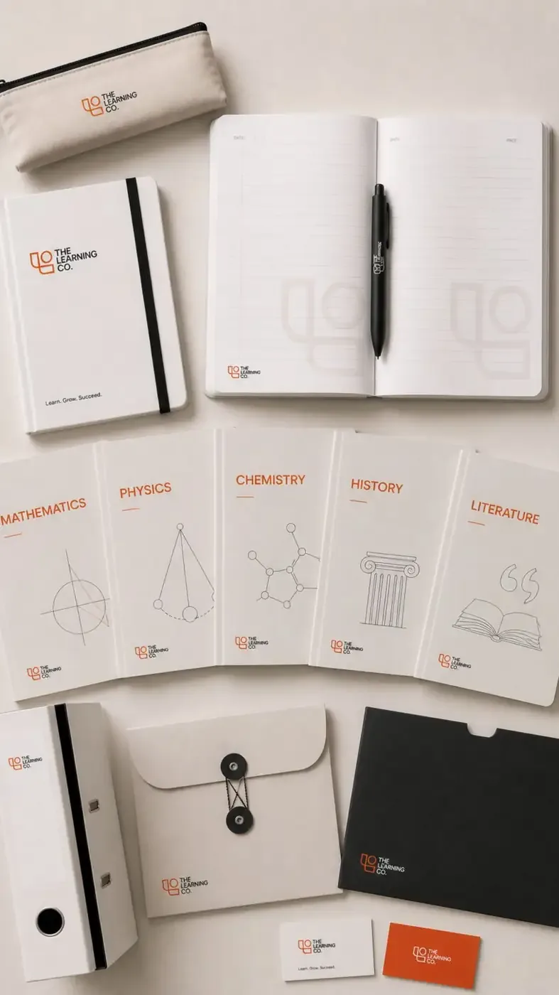
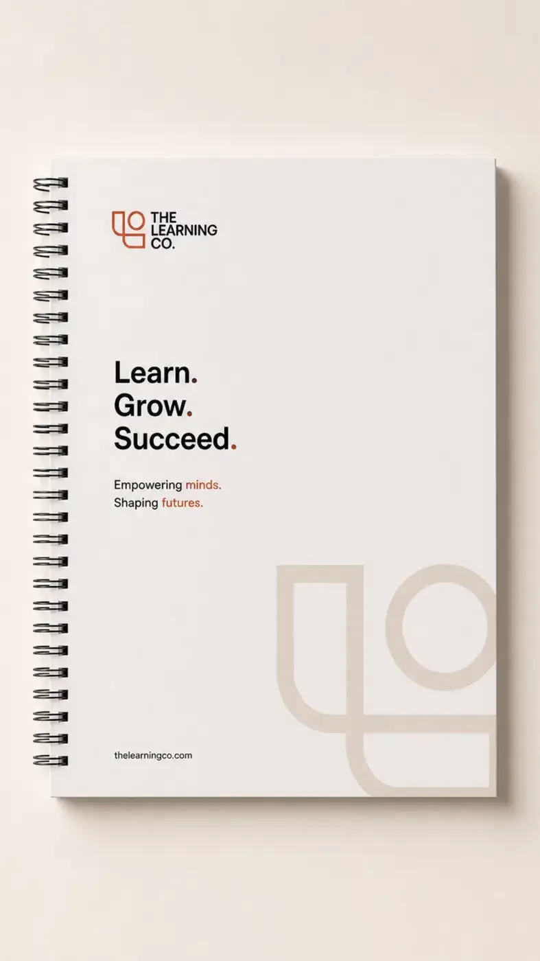
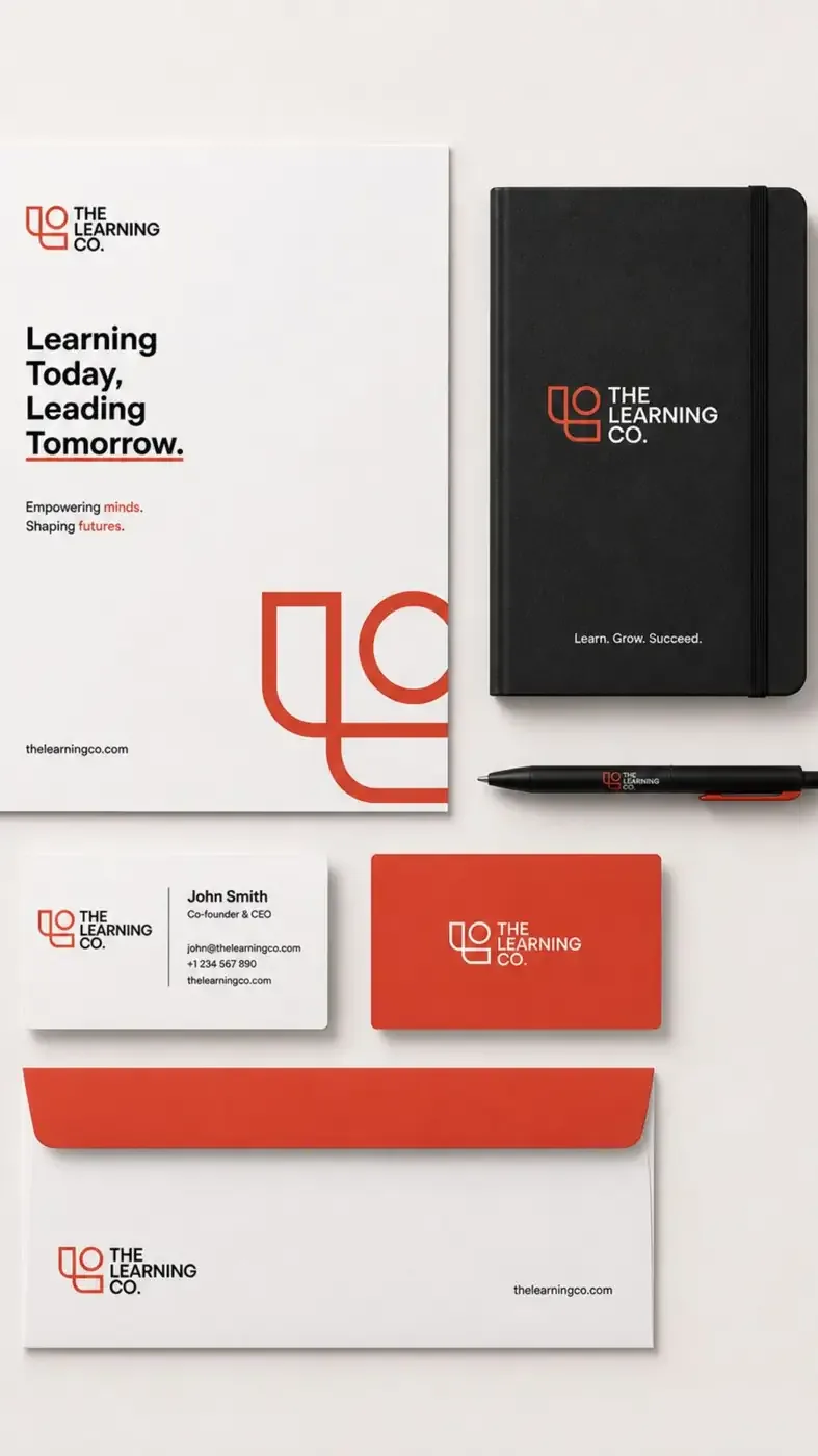
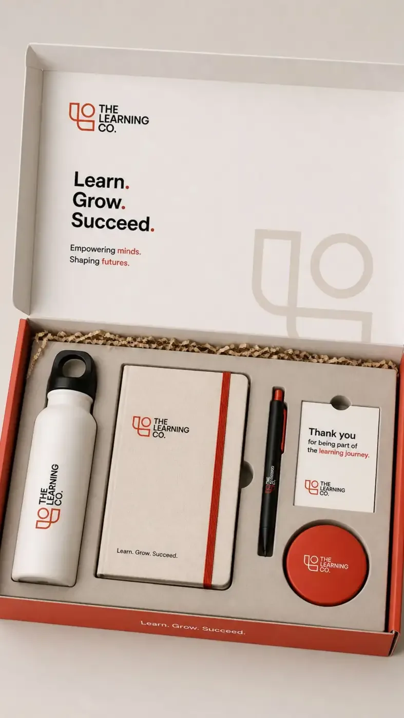
Logo variations
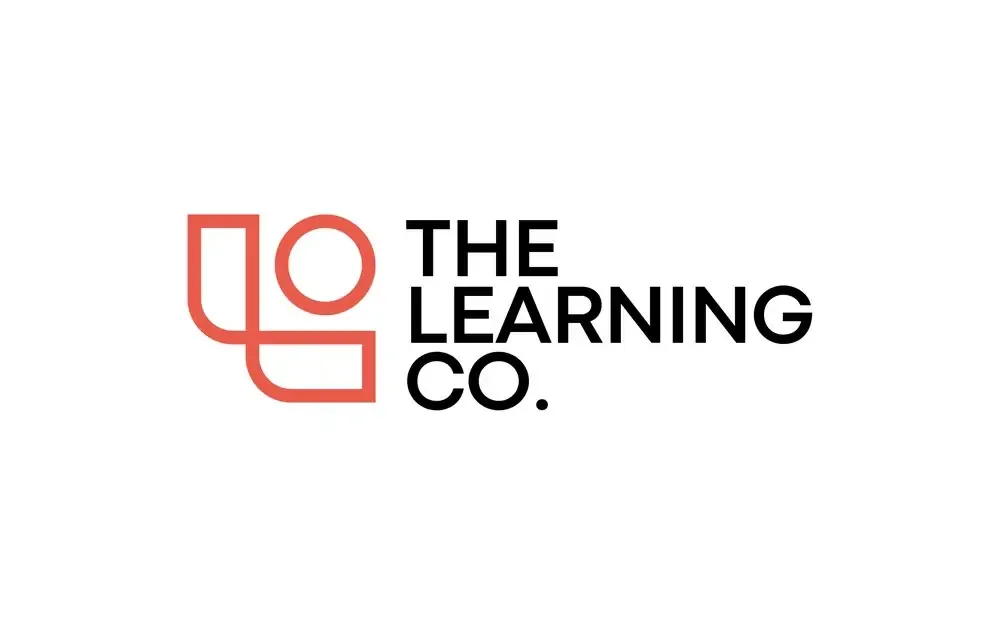
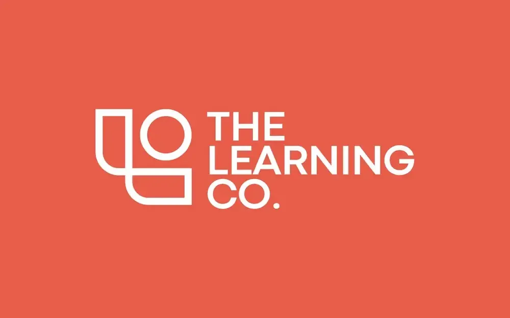
Colour & visual language
Coral orange paired with black, white and warm neutrals for a bold yet balanced look.
Coral
#E95C4CBlack
#111111White
#FFFFFFWarm Neutral
#E4DDD4Typography
Clean, bold and highly legible typography with strong visual hierarchy.
Packaging direction
Minimal, functional packaging with white bases, coral accents and subtle oversized brand graphics.
Photography direction
Bright, natural and human — focusing on curiosity, collaboration and real learning moments.
Brand applications
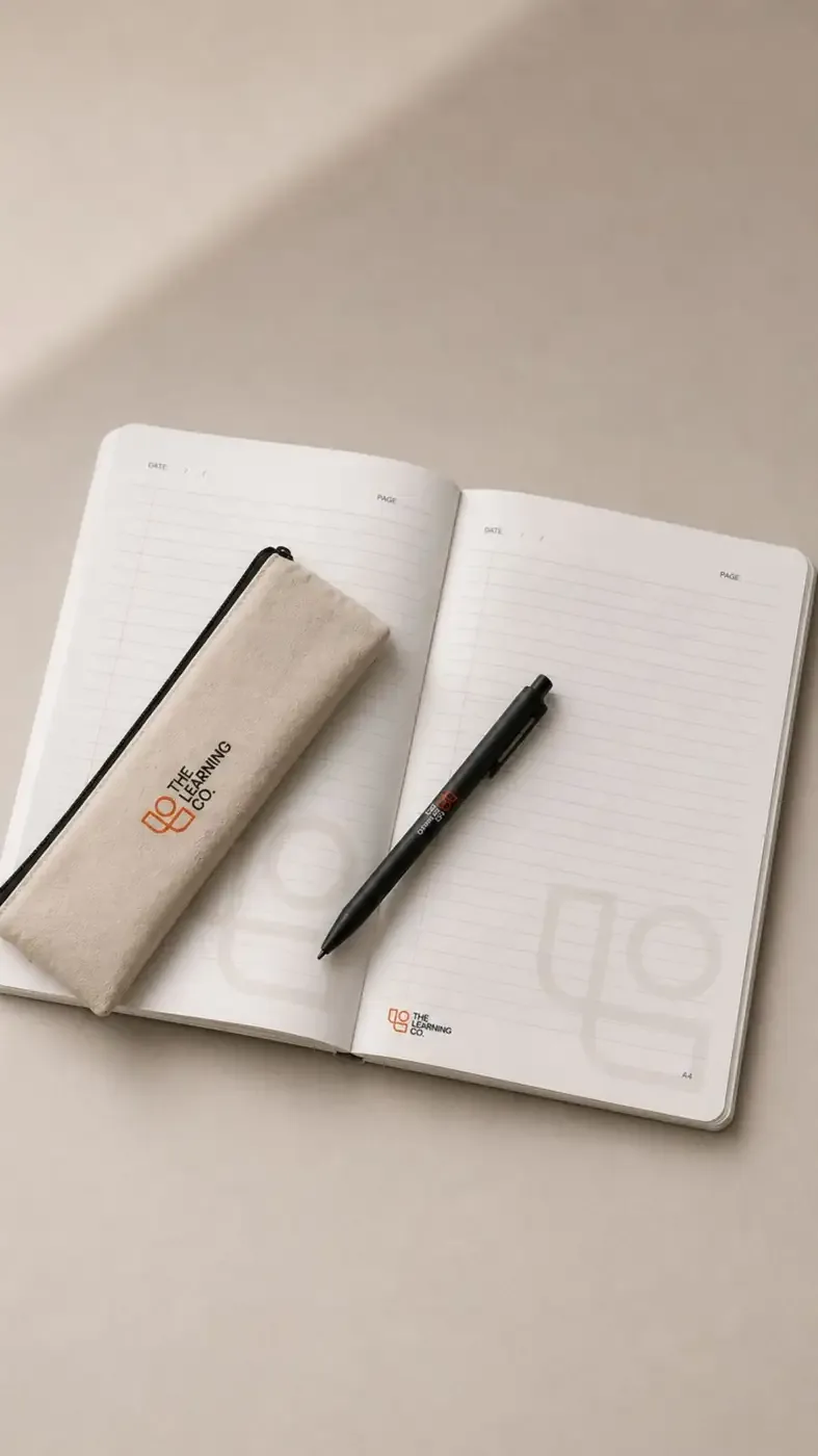
- Stationery
- Notebooks
- Bags
- Bottles
- ID Cards
- Folders
- Merchandise
- Learning Materials
Brand story
A brand that sees learning as a continuous journey of curiosity, growth and discovery.
Brand aesthetic
- Modern
- Optimistic
- Clean
- Approachable
- Future-focused
The Learning Co. — Learn. Grow. Succeed.