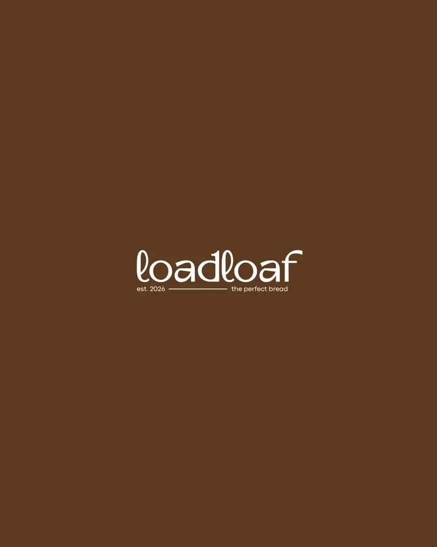
Loadloaf
Good bread, made with care.
The brief
Loadloaf is a modern artisanal bakery built around the simple idea of good bread, made with care. The brand needed an identity that felt warm, premium and handcrafted while still being approachable enough for everyday consumers.
The creative direction
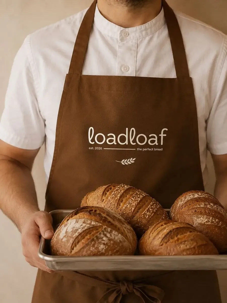
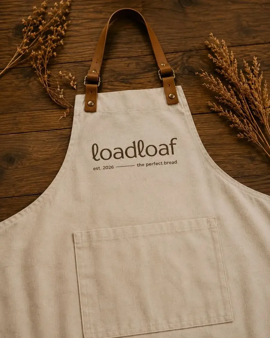
The identity was developed around warmth, simplicity and traditional baking craft. Earthy browns, warm creams, natural textures and minimal typography create a visual language inspired by freshly baked bread, kraft packaging and the warmth of a neighbourhood bakery.
Colour palette
#2E1D12#5D3A20#8A5A33#C9A57E#F1EAE0Deliverables
- Brand Identity
- Logo & Lockup
- Colour Palette
- Typography
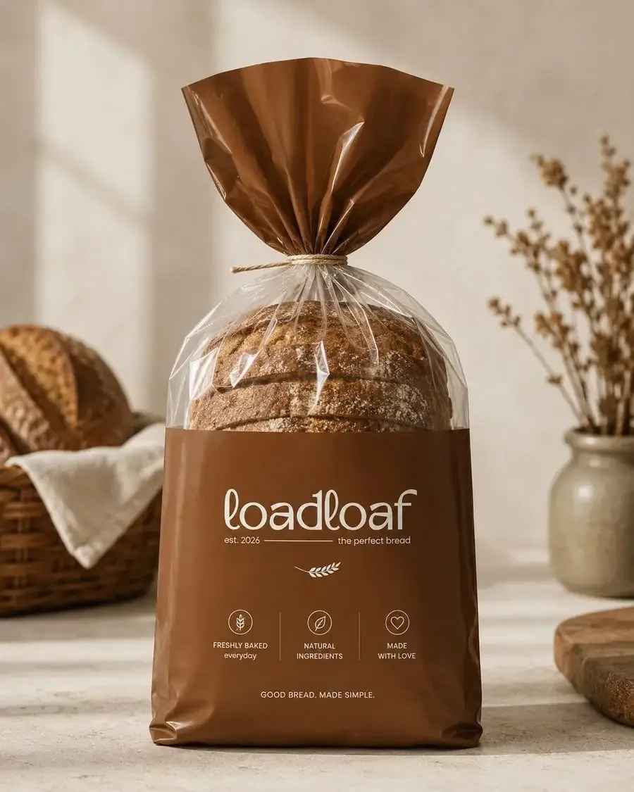
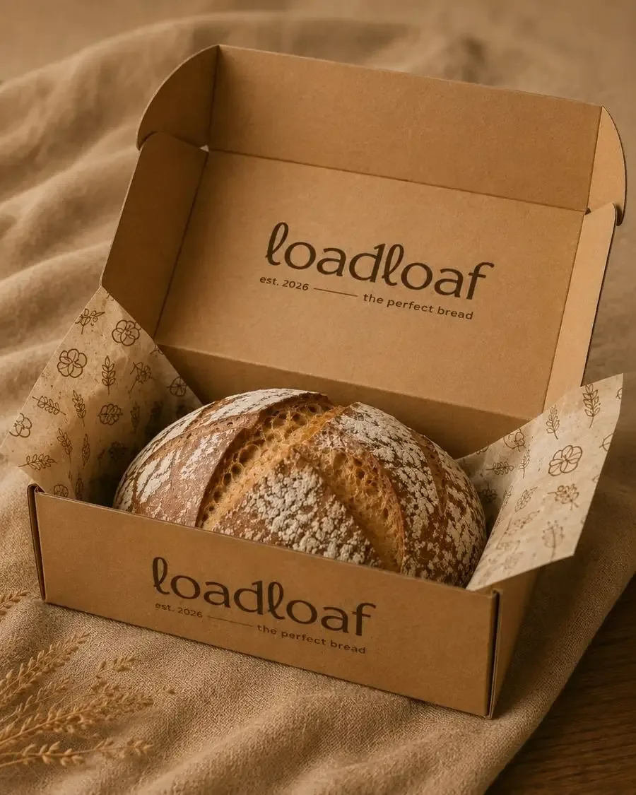
- Packaging Design
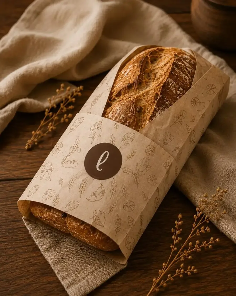
- Bread Bags & Sleeves
- Bakery Boxes
- Apron & Staff Branding
- Pattern & Illustration System
- Brand Photography Direction
The visual story
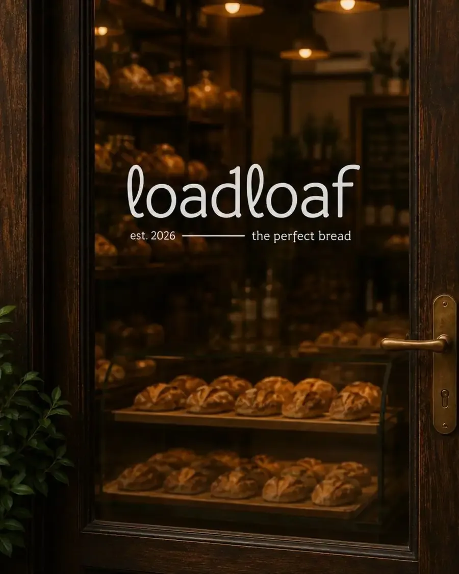
The brand combines modern minimalism with traditional bakery cues, using rich browns, cream tones, grain-inspired illustrations and tactile materials to create a cohesive and memorable bakery experience.
Loadloaf — The Perfect Bread.