MoonMilk Coffee
Bold, refreshing, unmistakably blue.
The brief
MoonMilk Coffee is a contemporary coffee brand created around the idea of making everyday coffee moments feel bold, refreshing and memorable. The brand needed a distinctive identity that could stand out in a crowded café market while remaining clean, youthful and highly recognisable.
The creative direction
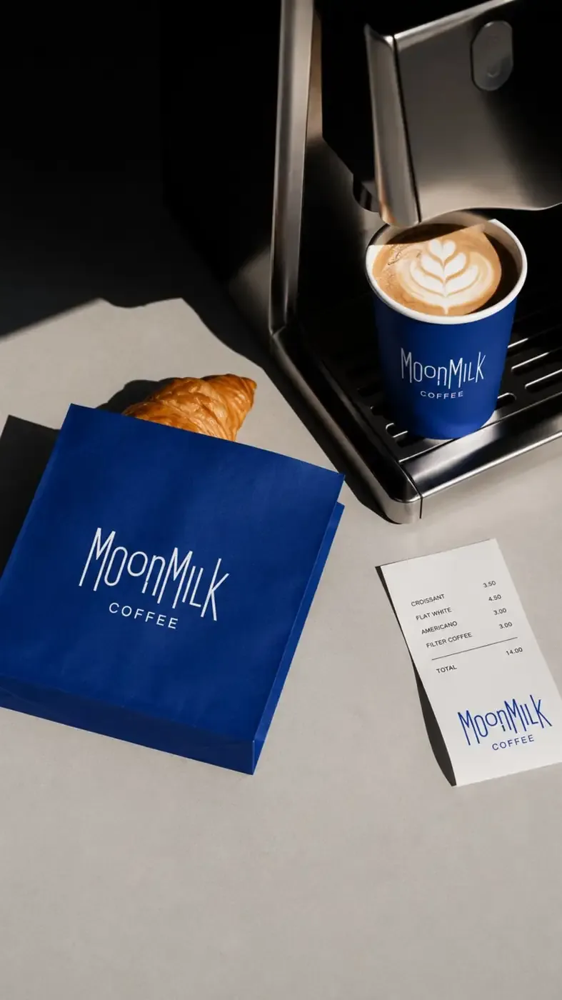
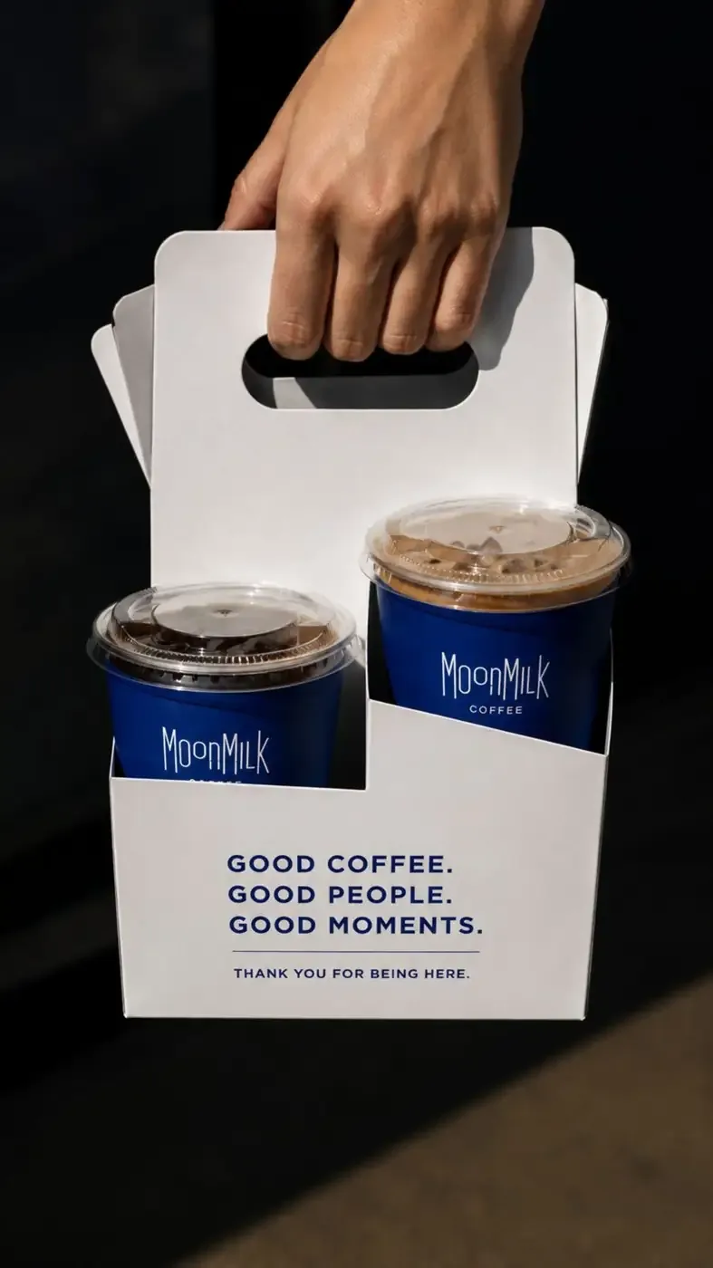
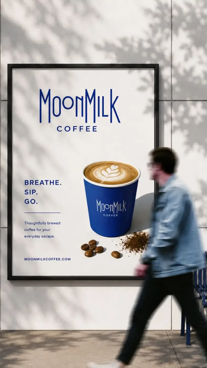
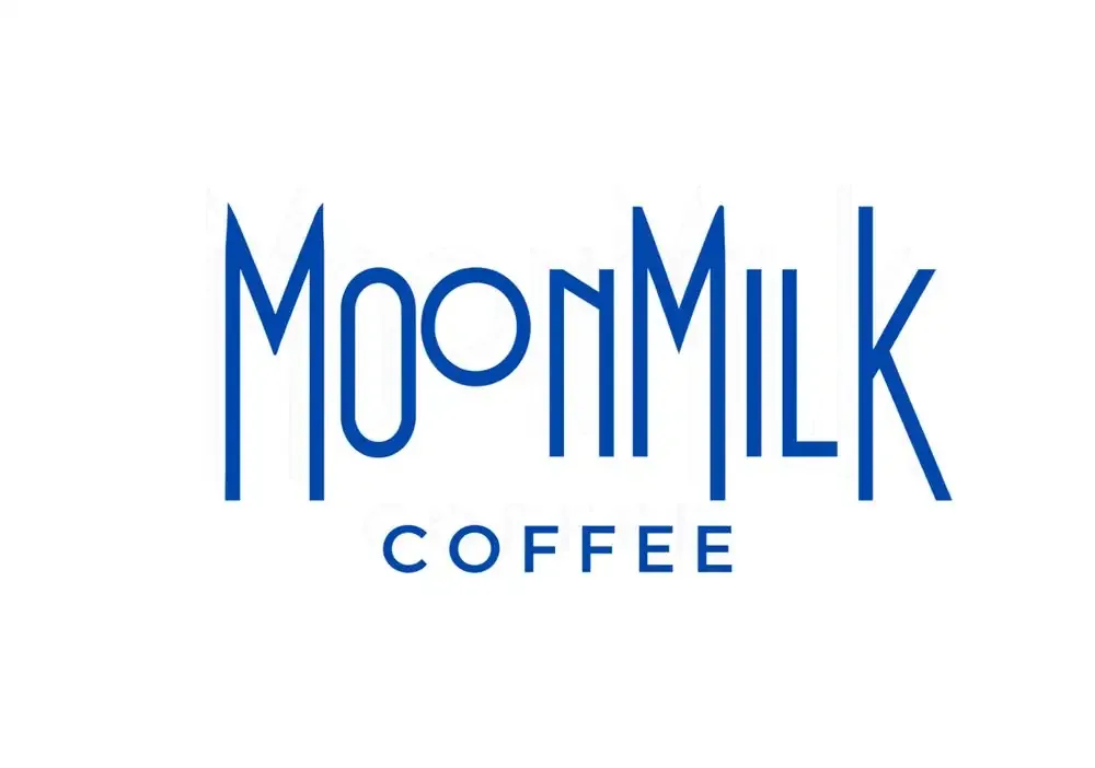
The identity is built around a striking electric blue and white colour palette, paired with a tall, condensed wordmark. The result is a visual language that feels modern, confident, energetic and slightly unconventional. The branding balances the premium feel of specialty coffee with a more playful, lifestyle-driven personality.
Logo variations
Colour palette
#0047AB#FFFFFF#1B2A5E#C49A6C#15120BDeliverables
- Brand Identity
- Logo & Logo Variations
- Colour Palette
- Typography System
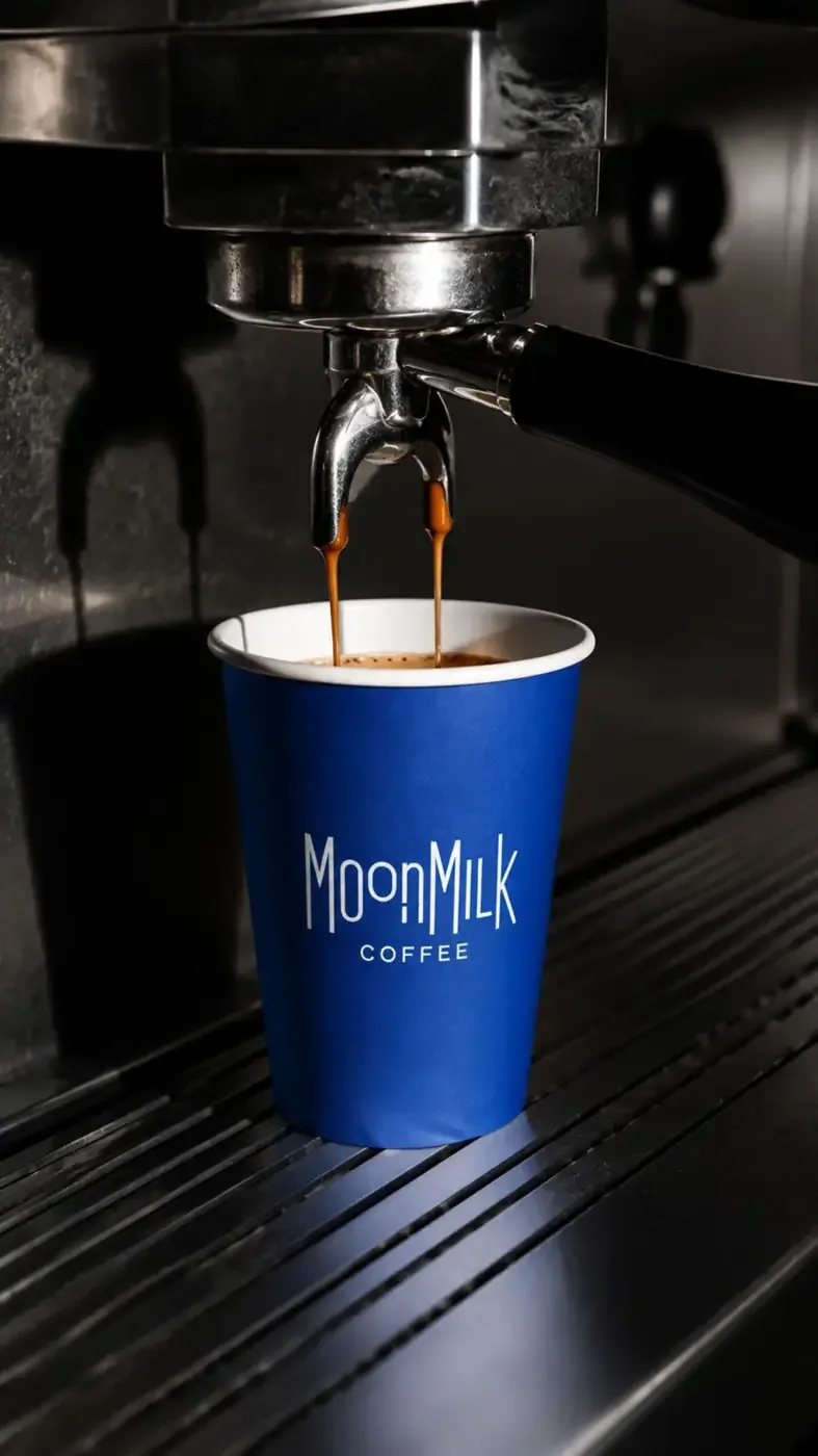
- Coffee Cup & Packaging Design
- Takeaway Packaging
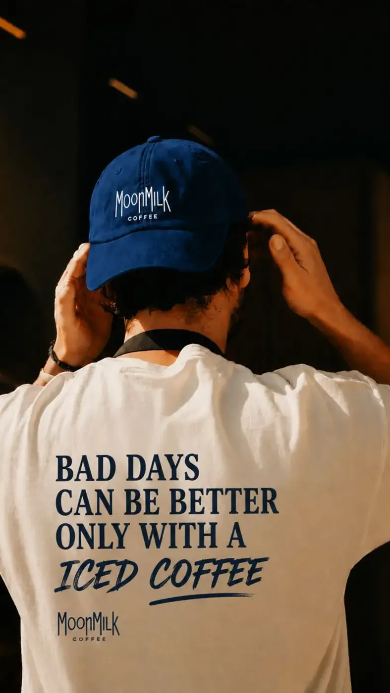
- Staff Merchandise
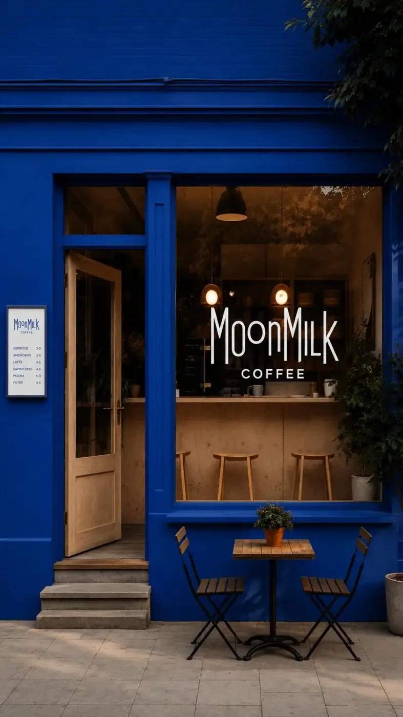
- Café Exterior Branding
- Menu & Collateral
- Outdoor Advertising
- Social/Marketing Visual Direction
The visual story
The bold blue becomes the signature of MoonMilk Coffee, creating instant recognition across the café, cups, merchandise and advertising. Photography combines deep shadows, warm coffee tones and strong blue accents, while bold copy such as “Bad Days Can Be Better Only With A Iced Coffee” gives the brand a youthful and relatable voice.
MoonMilk Coffee — thoughtful coffee for your everyday escape.