Quiet Skin
Skincare for a calmer you.
The brief
Quiet Skin was created to build a skincare brand that feels calm, considered and modern in a category often dominated by loud colours, excessive claims and visual clutter. The objective was to create an identity that communicates simplicity, trust and quiet confidence, while still feeling premium and distinctive.
The creative direction
The creative direction is rooted in the idea of “quiet luxury for your skin.” Rather than competing for attention, the brand uses restraint as its defining characteristic. Clean layouts, generous negative space, structured typography and subtle details create an identity that feels confident without being loud.
Logo variations
Colour & visual language
The visual language is intentionally monochromatic, built around black, white, charcoal, warm grey and soft neutrals. The contrast gives the brand a sophisticated and contemporary presence, while textured surfaces and soft shadows prevent the identity from feeling overly clinical.
#111111#1D1D1D#A9A39C#E4E0DA#F8F8F8Typography
Typography is clean, modern and highly refined. The delicate wordmark creates a sense of softness, while the structured secondary typography brings clarity and functionality. Generous spacing allows the typography to breathe and reinforces the brand’s calm personality.
Packaging direction
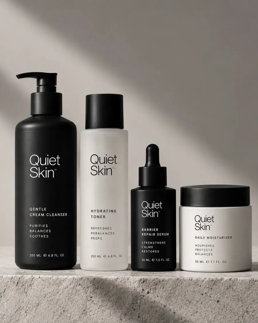
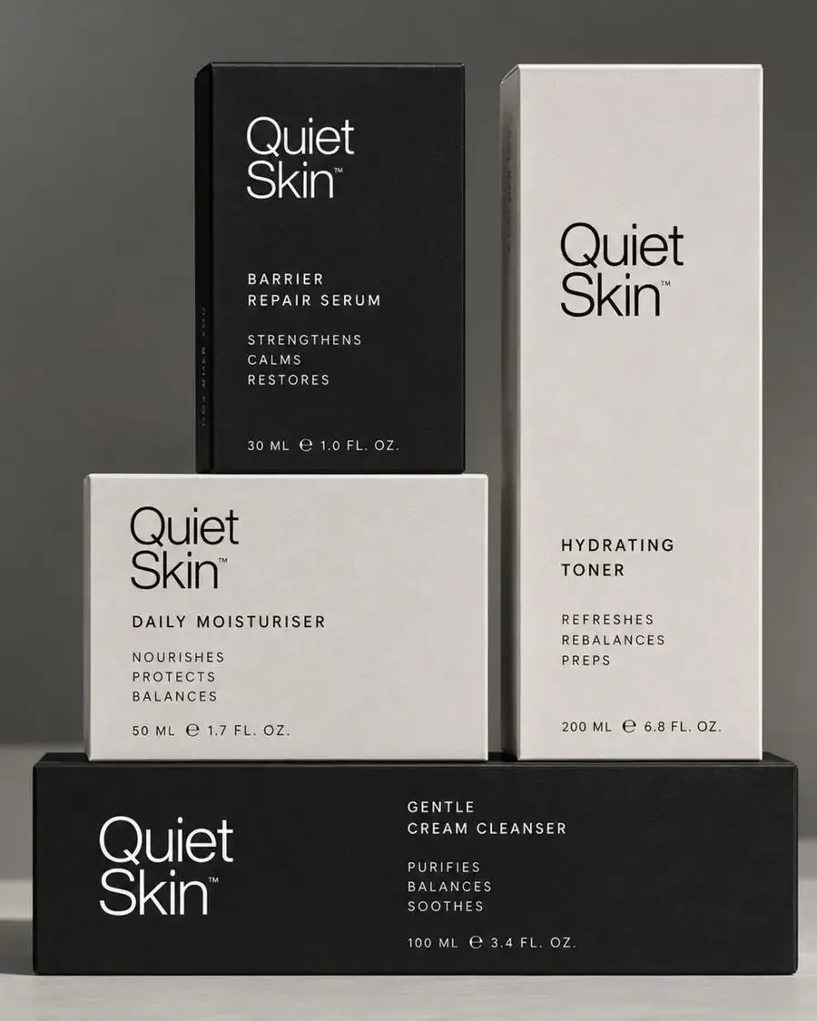
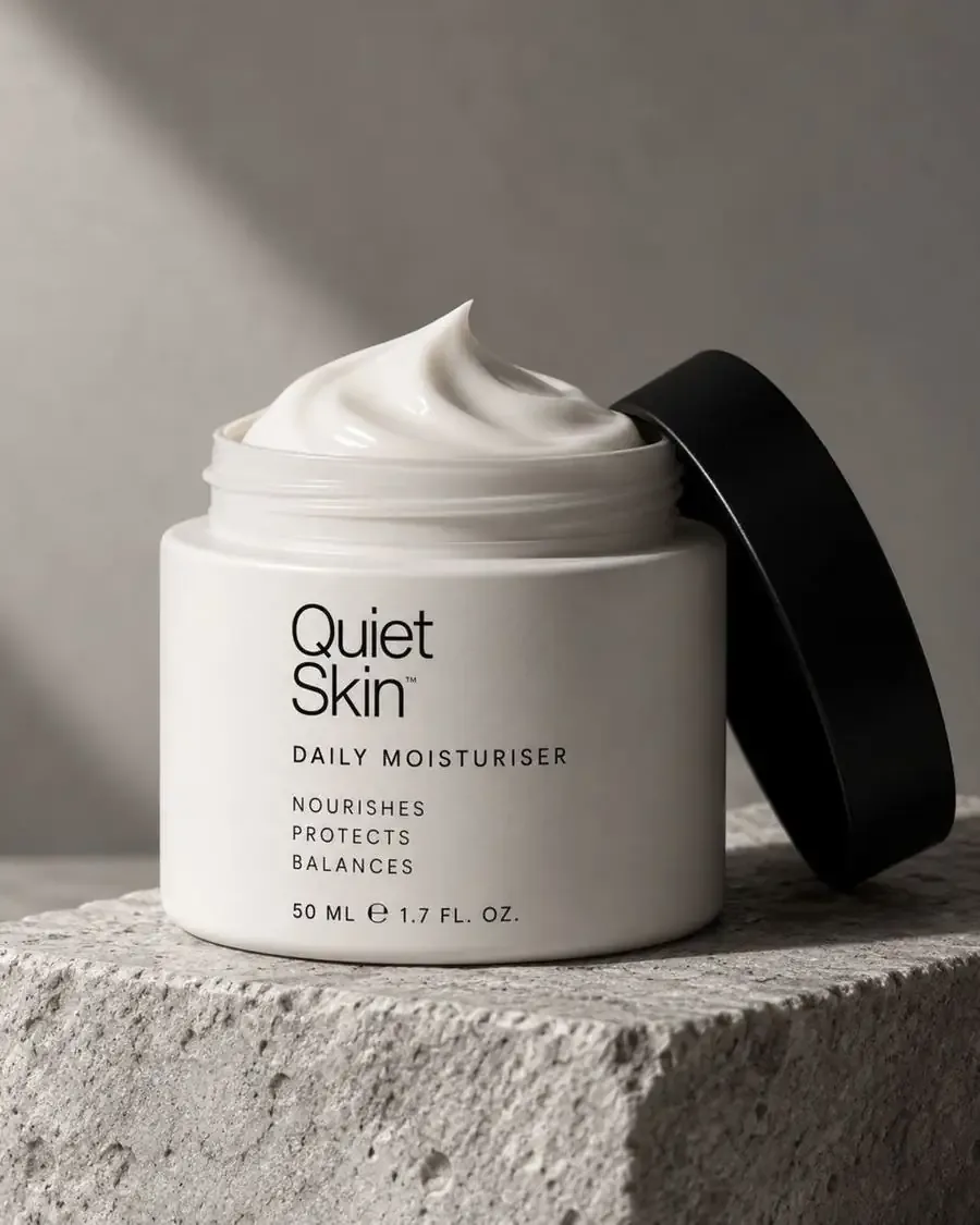
Packaging follows a simple black-and-white system with strong product hierarchy. Minimal layouts, tactile finishes, clean labels and carefully positioned information create a premium shelf presence. Each product feels part of the same family while retaining its own identity.
Photography direction
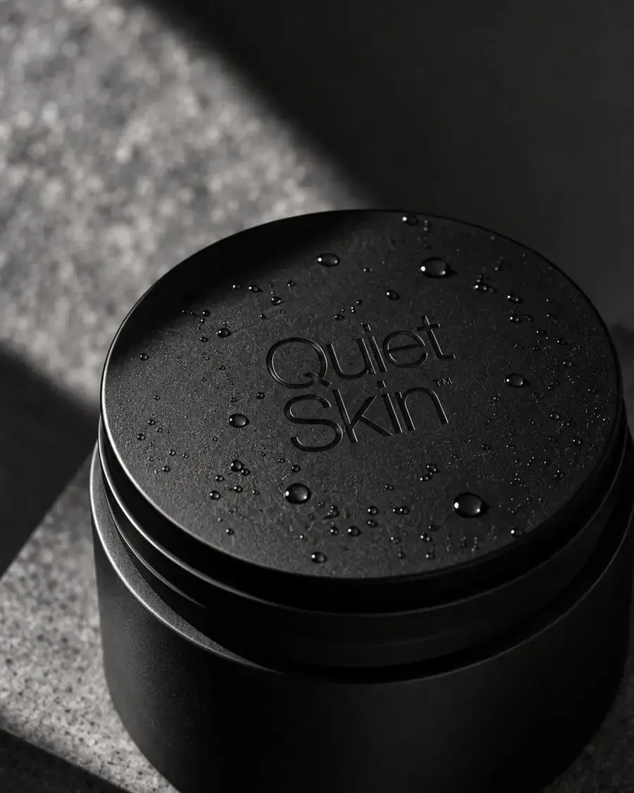
Photography focuses on soft natural light, stone textures, muted environments, close-up product details and tactile skincare moments. Cream textures, shadows, materials and subtle imperfections add depth while maintaining the overall sense of calm.
Brand applications
The system is designed to remain recognisable even when used with minimal branding.
- Product Labels
- Cartons
- Bottles
- Jars
- Social Media
- Website Assets
- Stationery
- Campaign Creatives
- Brand Communication
Brand story
Quiet Skin is built around a simple belief: skincare doesn’t need to be complicated to feel luxurious. It creates thoughtful products and rituals that encourage people to slow down, simplify their routines and reconnect with their skin.
Brand aesthetic
- Minimal
- Calm
- Refined
- Tactile
- Contemporary
- Premium
Quiet Skin — Skincare for a calmer you.
Everyday skincare as a quiet ritual — less noise, fewer distractions and more intention.