Skinthings
Earthy luxury × effortless resort living × tactile minimalism.
The brand idea
A contemporary resortwear brand designed around sun, skin, movement and effortless summer living. The identity needed to feel tactile, warm and premium without becoming overly polished.
The visual direction
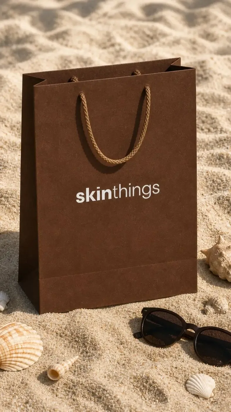
Quiet luxury meets a sun-soaked beach aesthetic — earthy tones and tactile textures create a strong, recognisable world with plenty of room to breathe.
The wordmark
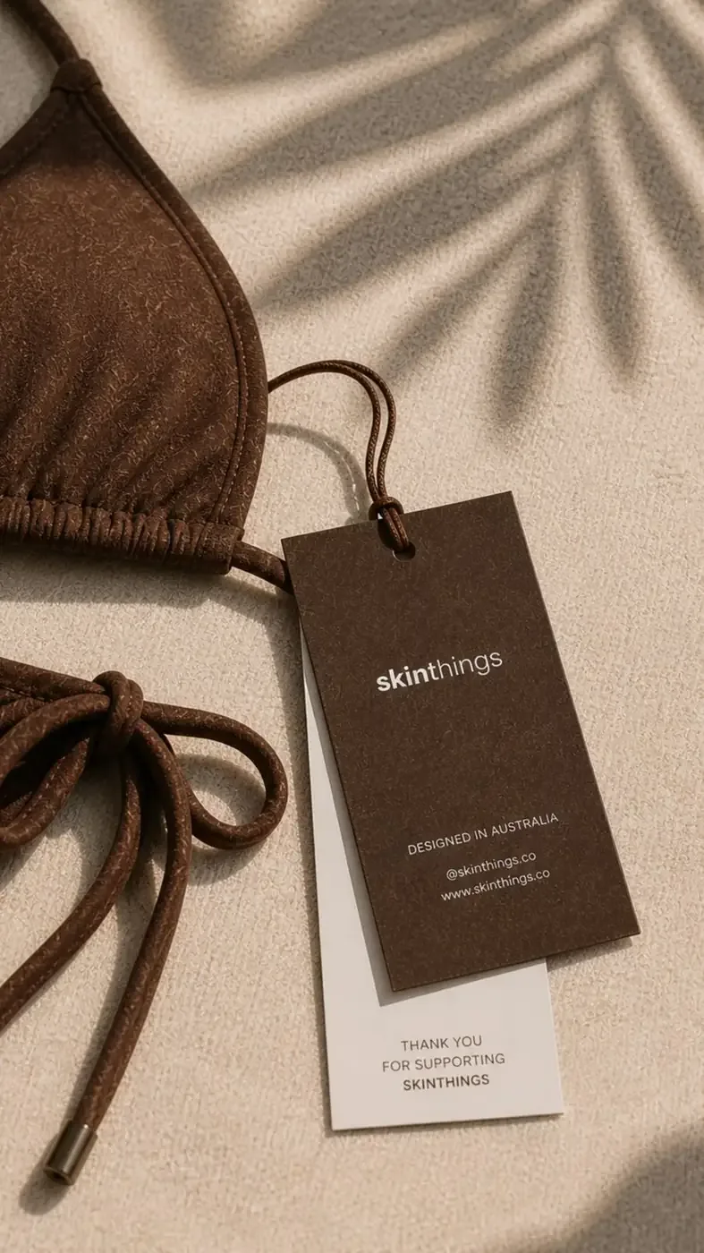
A clean, lowercase skinthings wordmark built on bold + lightweight typographic contrast — a heavier “skin” grounded against an airy “things”, echoing the balance between body and ease.


Core visual elements
- Lowercase Wordmark
- Bold + Light Type Contrast
- Sand, Skin & Fabric Textures
- Subtle Tonal Patterns
- Minimal Graphic Applications
- Generous Negative Space
Colour palette
Deep chocolate brown anchors the brand, softened by warm sand, soft cream, off-white and a subtle tan.
#4B2C1F#A0694A#D9C4A3#EFE6D8#F8F5F0Photography direction
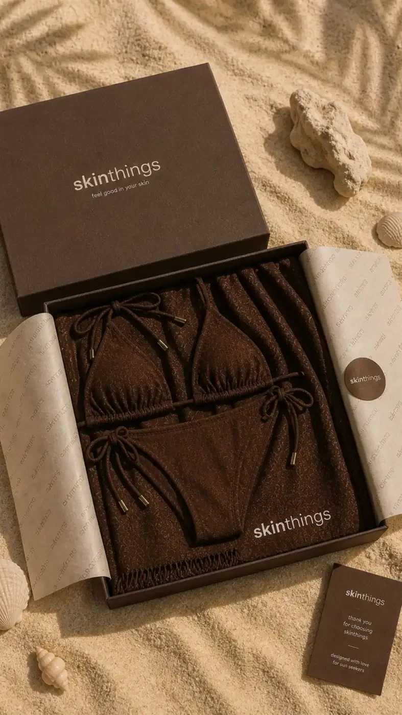
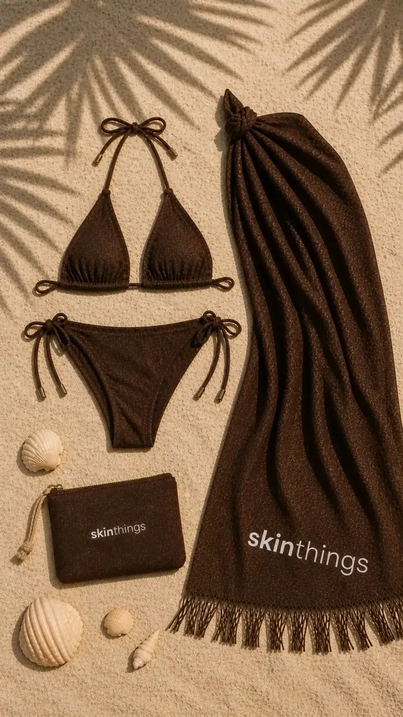
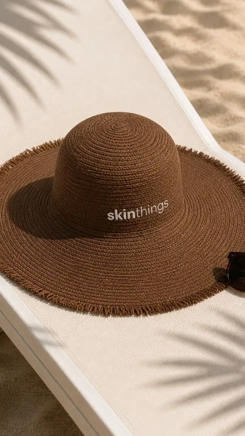
Sensory, editorial beach imagery: sun-kissed skin, swimwear details, sand and natural textures, palm shadows, resort settings, hats, scarves and accessories, packaging and unboxing, and relaxed, candid summer moments.
Brand applications
- Swimwear
- Resortwear
- Packaging
- Shopping Bags
- Hangtags
- Gift Boxes
- Accessories
- Social Media
- E-commerce
Brand personality
- Minimal
- Warm
- Sensual
- Natural
- Relaxed
- Contemporary
- Premium
Skinthings — less about dressing for the beach, more about capturing the feeling of being there.