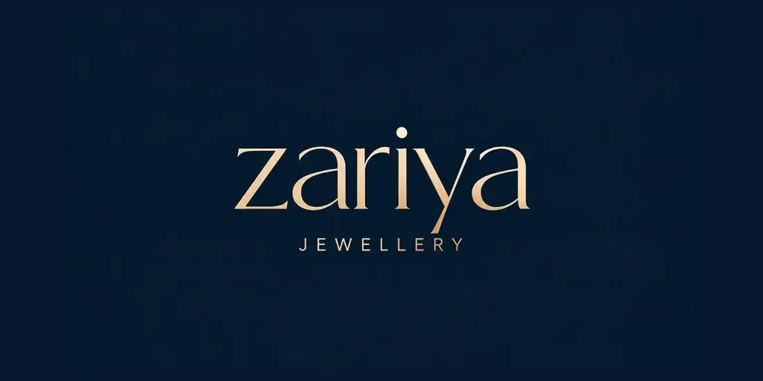
Zariya
Quiet luxury, beautifully boxed.
The brief
Zariya is a jewellery brand built around quiet luxury, timeless elegance and refined craftsmanship. The identity needed to feel sophisticated and premium while remaining minimal and highly recognisable across jewellery, packaging and brand touchpoints.
The creative direction
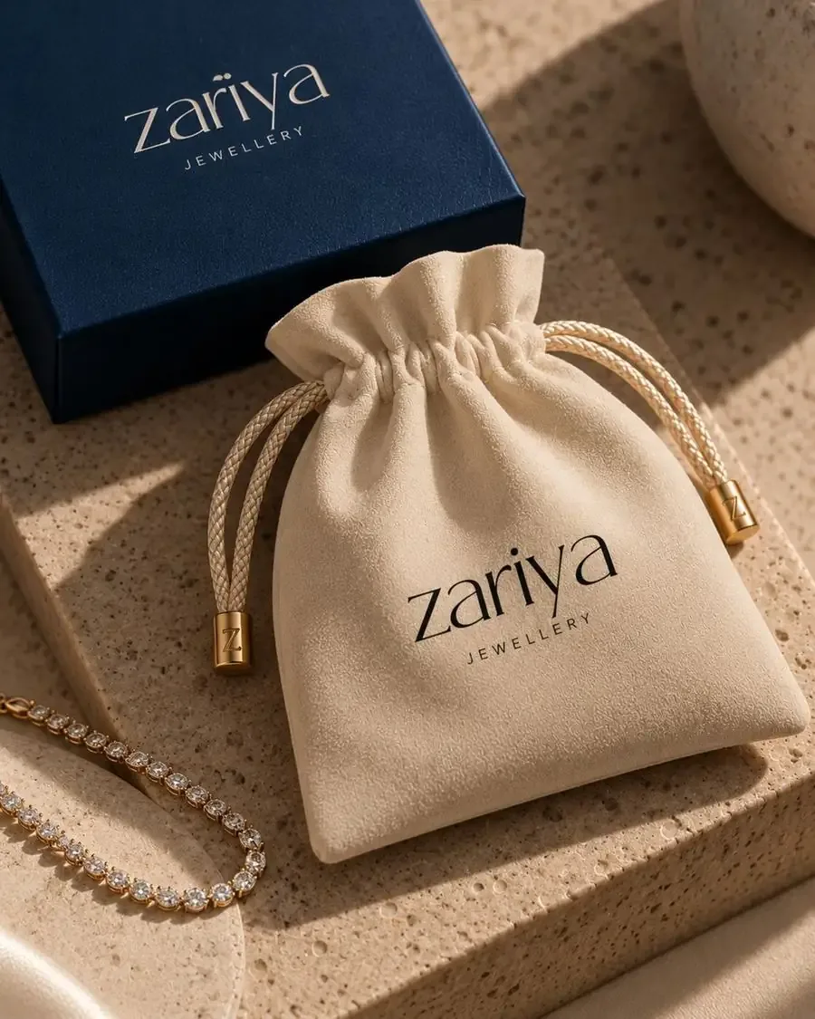
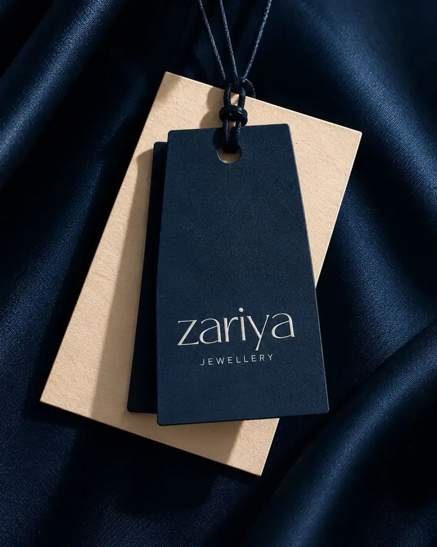
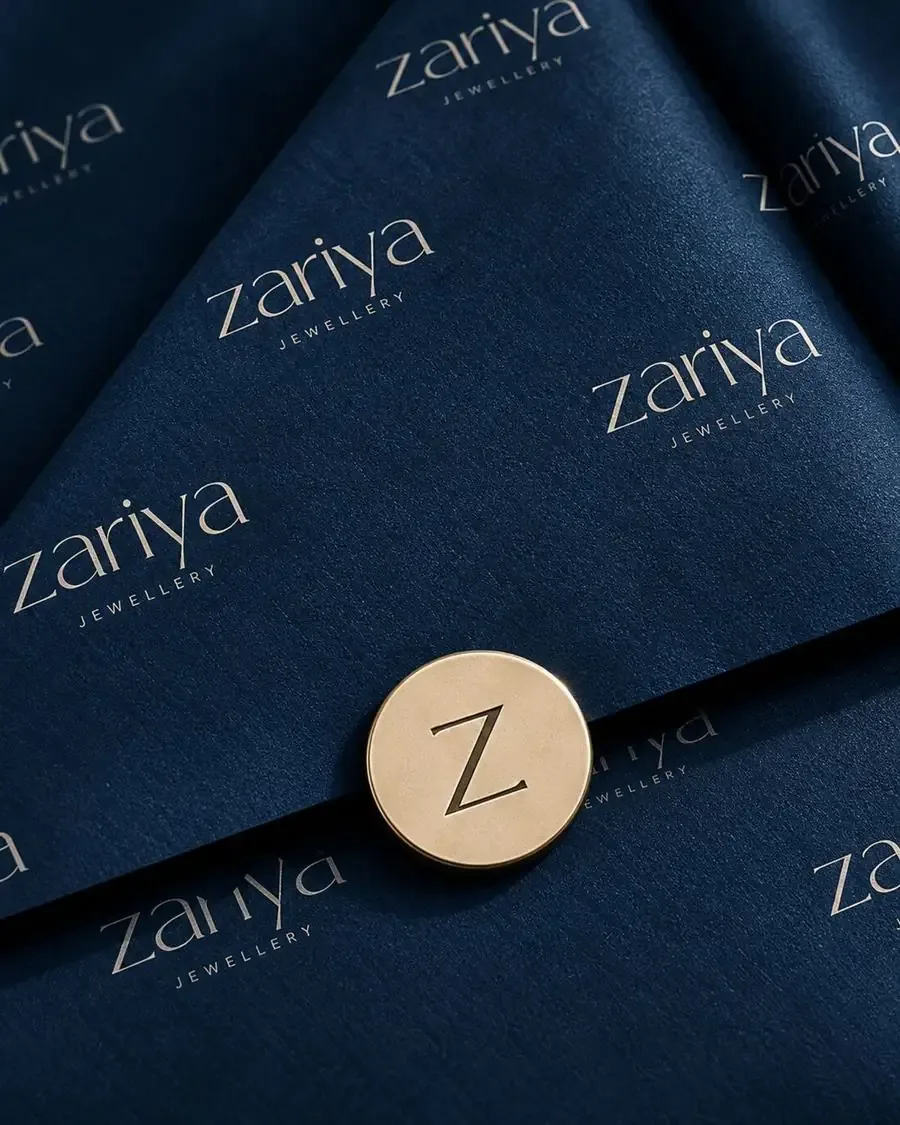
The visual identity is centred around a deep midnight navy and champagne-gold palette, creating a luxurious yet contemporary aesthetic. The elegant lowercase “zariya” wordmark gives the brand a soft, feminine character, while the refined typography adds a sense of exclusivity. The simplicity of the identity allows the jewellery itself to remain the hero.
Colour palette
#051A30#D9B48A#D1AF86#EFE4D2Deliverables
- Brand Identity
- Logo & Wordmark
- Typography System
- Colour Palette
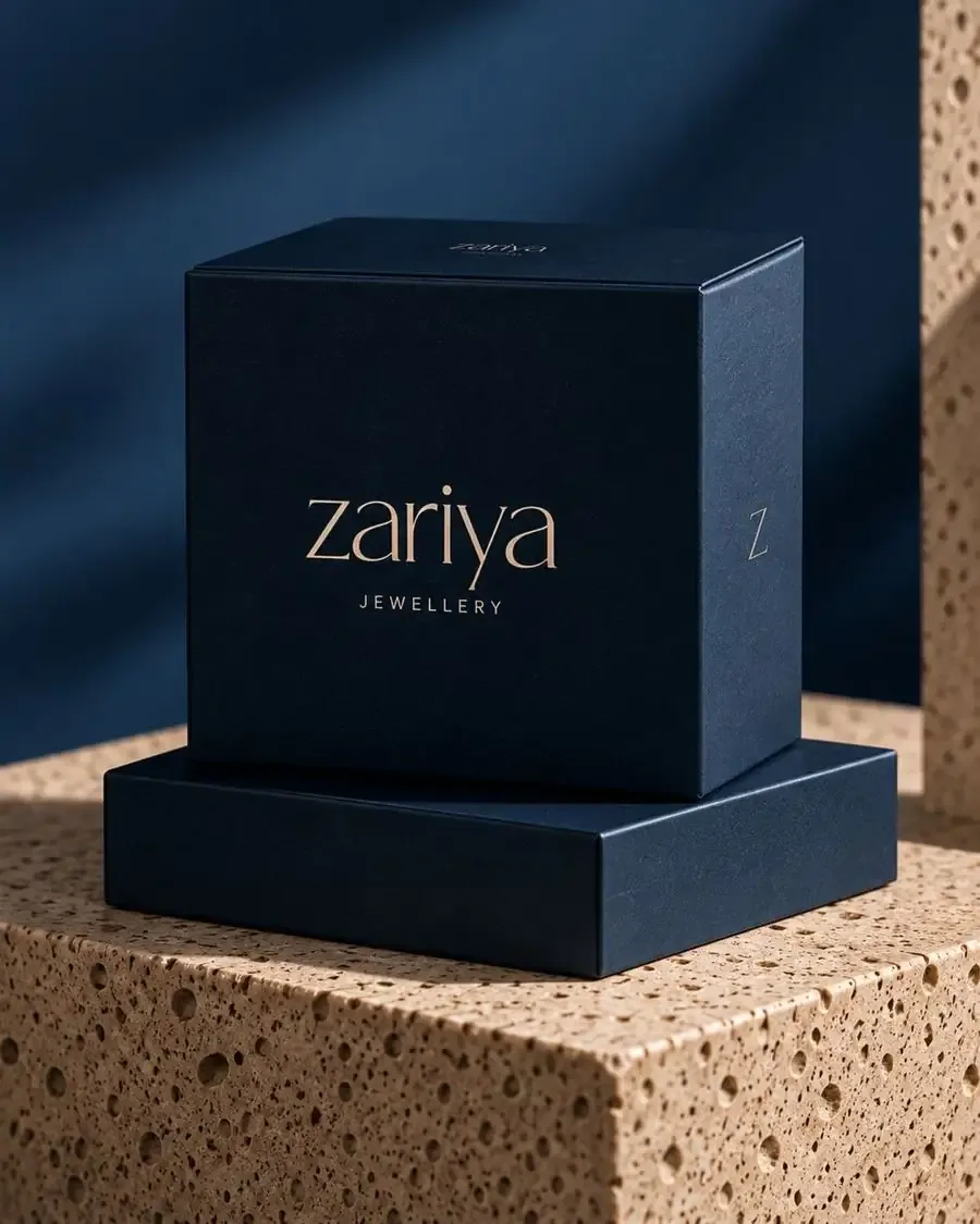
- Jewellery Packaging
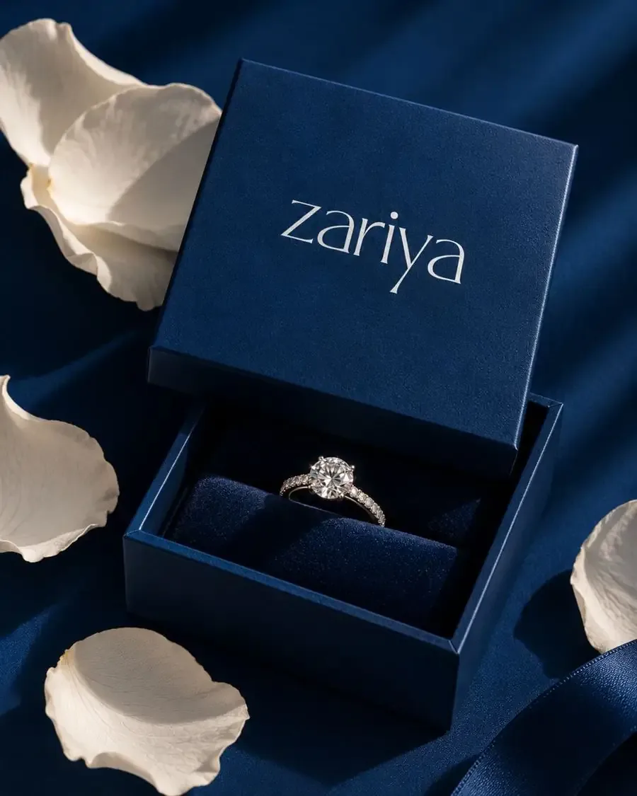
- Premium Jewellery Boxes
- Jewellery Pouches
- Product Tags & Labels
- Brand Collateral
- Packaging Photography Direction
The visual story
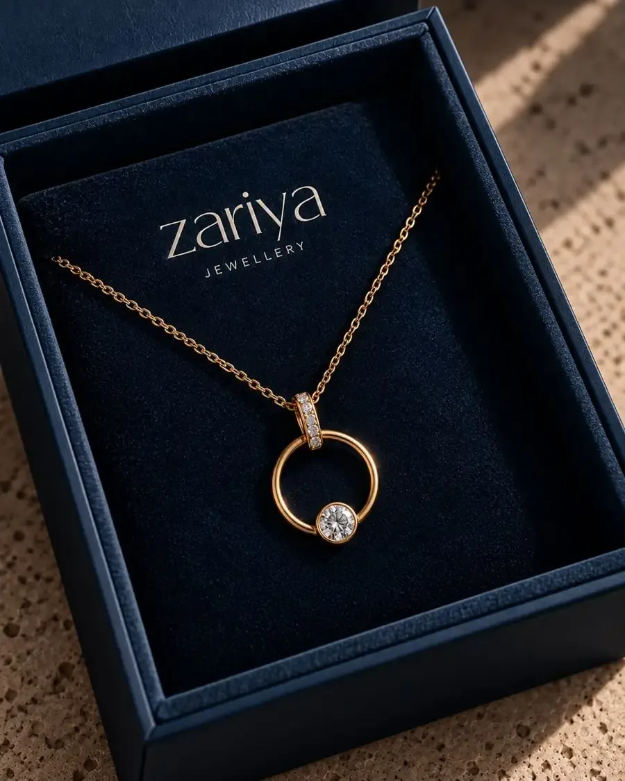
The packaging experience was designed to feel like opening a luxury keepsake. Deep navy textured surfaces create depth, while champagne-gold detailing adds warmth and sophistication. From the structured jewellery boxes to the soft fabric pouches, every touchpoint follows the same visual language, creating a cohesive and elevated unboxing experience.
Brand aesthetic
- Quiet Luxury
- Feminine
- Timeless
- Refined
- Contemporary
Zariya — Jewellery, beautifully understated.